This is personal opinion so likely not be shared by everyone. Feel free to remove this if it's not appropriate. Could just be the way they render for me?
I just took a look at How Metabase uses Metabase and it's an interesting article. I may do a similar analysis for myself.
However, the timeseries charts render with only 1 x-axis label, the month of January, 2020
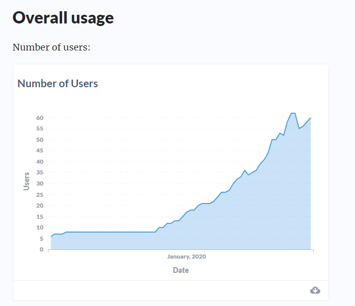
When glancing at the charts it's not immediately obvious what the time granularity is. A moment's thought tells me it's monthly as that's all the information given in the label, but it did take that moment to figure out. This also tells me very little about the range of dates, it's only on reading the commentary that it's made clear that the data goes back to 2016.
There's sooo much space on that x axis, why can there not me more labels? I strike this myself when making charts in Metabase, sometimes I just want more timeseries x axis labels. Doesn't have to be all of them, but more than one would be great. I'd love to get a bit more control on this within Metabase to help the charts convey more information quickly.
My 2 cents. Thanks