Hello,
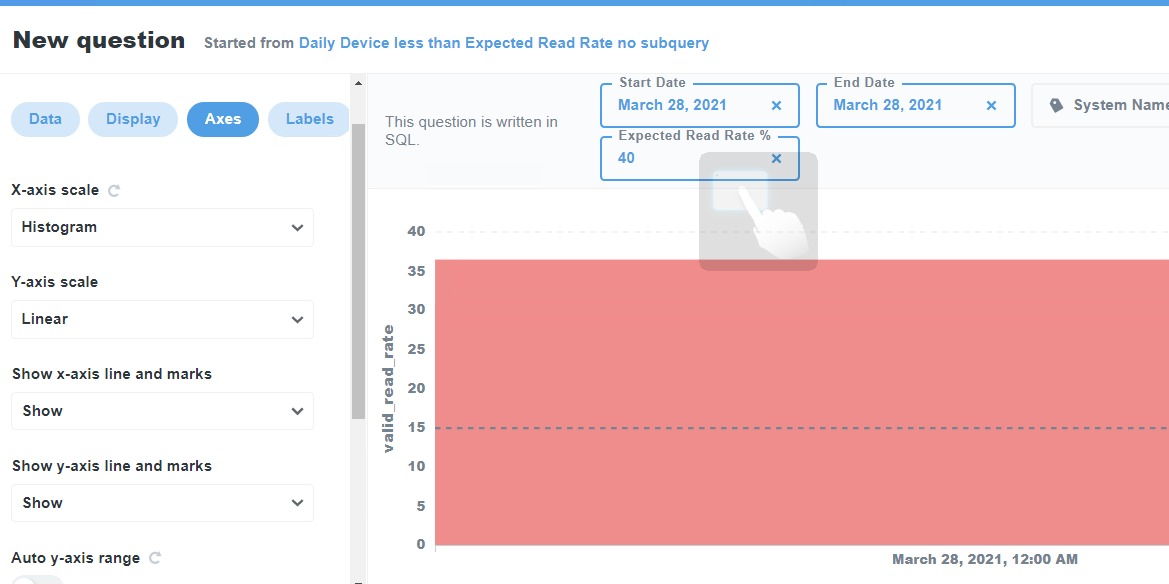
I've been reviewing the documentation to MetaBase reporting, and it's very impressive. However, I haven't been able to figure out why the visualization of a percentage query, which shouldn't exceed 100%, shows values going well over that.
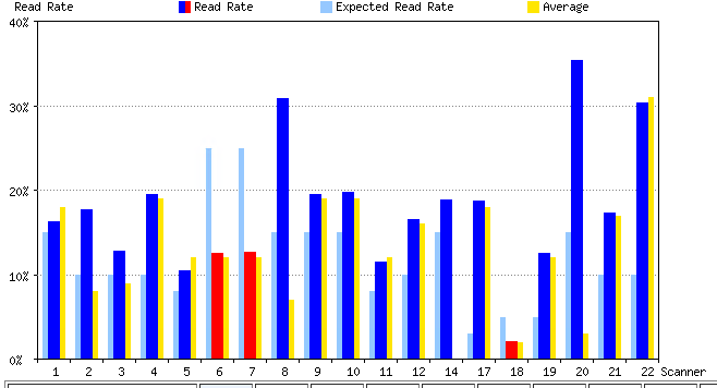
Here's an image of the graph:

This is the query:
SELECT left(from_unixtime(c.capture_time / 1000), 10) as date,
       a.name as 'system_name',
       b.name as 'device_name',
       c.read_count,
       c.valid_object_count,
       (read_count / valid_object_count * 100) as valid_read_rate
FROM sick_il_services.system_config a
         join sick_il_services.system_device b on a.id = b.system_id
         join sick_il_aap.daily_device_read_rate c on b.id = c.device_id
group by c.capture_time, a.name, b.name
having 1 = 1
[[AND c.capture_time >= unix_timestamp(concat({{start_date}}, ' 00:00:00.000')) * 1000 ]]
[[AND c.capture_time <= unix_timestamp(concat({{end_date}}, ' 23:59:59.999')) * 1000]]
[[AND a.name = '{{system_name}}']]
and valid_read_rate < {{expected_read_rate_percent}}
I noticed there was a warning message that says "date is an unaggregated field - if it has more than one value on a point in the x-axis, it's values will be summed". However, I've tried using the "capture_time" which is grouped, with the same result. Also tried using the the AVG function on the date field, but again, no luck.
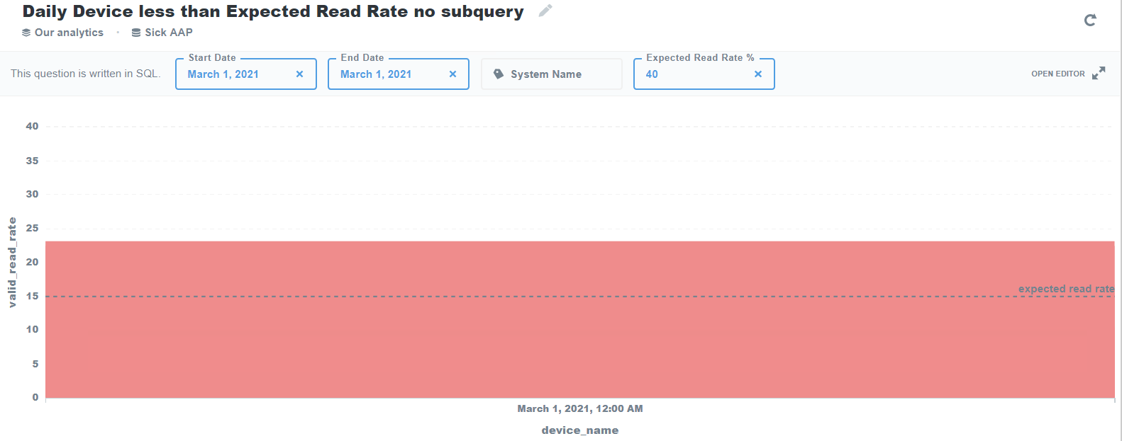
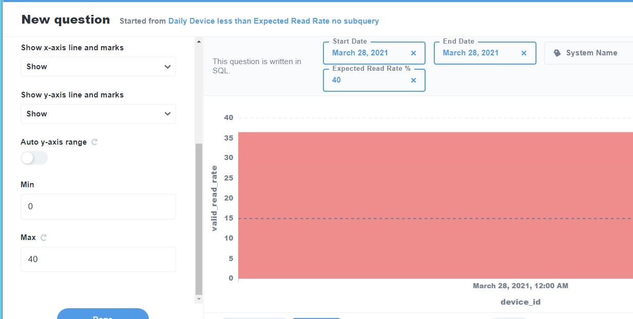
How do I get this to show 100% as the max?
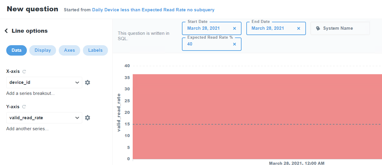
Also, is there a way to have each device to have a separate line in the graph, with maybe a separate color? That would be tremendously useful.
Thanks!