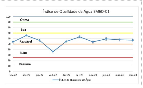
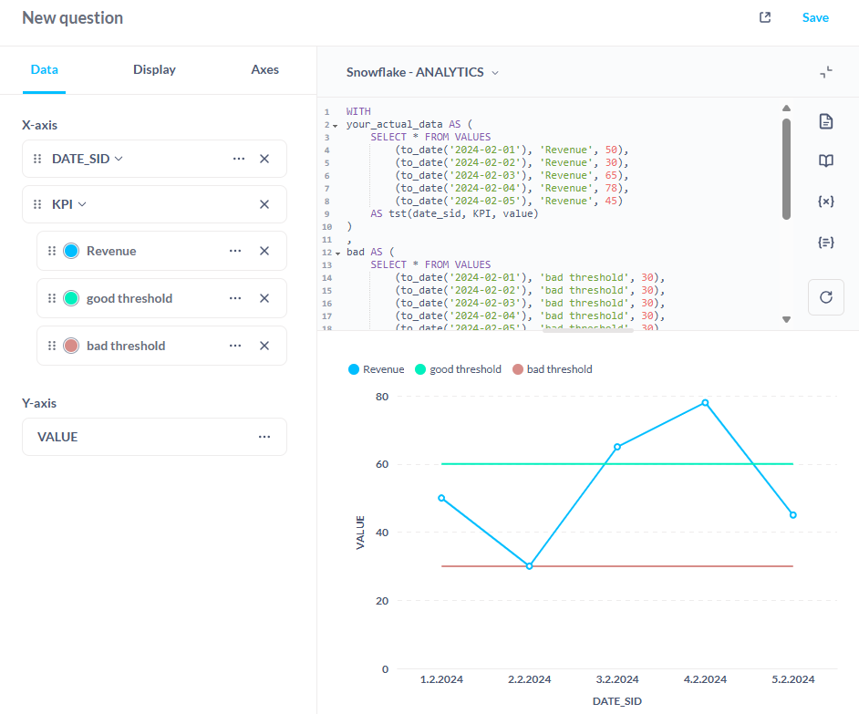
You could try to cook up something with some sql gymnastics, but it will be quirky and probably not what you are looking for. But non the less, had some fun with it:
WITH
your_actual_data AS (
    SELECT * FROM VALUES
        (to_date('2024-02-01'), 'Revenue', 50),
        (to_date('2024-02-02'), 'Revenue', 30),
        (to_date('2024-02-03'), 'Revenue', 65),
        (to_date('2024-02-04'), 'Revenue', 78),
        (to_date('2024-02-05'), 'Revenue', 45)
    AS tst(date_sid, KPI, value)
)
,
bad AS (
    SELECT * FROM VALUES
        (to_date('2024-02-01'), 'bad threshold', 30),
        (to_date('2024-02-02'), 'bad threshold', 30),
        (to_date('2024-02-03'), 'bad threshold', 30),
        (to_date('2024-02-04'), 'bad threshold', 30),
        (to_date('2024-02-05'), 'bad threshold', 30)
    AS tst(date_sid, KPI, value)
)
,
good AS (
    SELECT * FROM VALUES
        (to_date('2024-02-01'), 'good threshold', 60),
        (to_date('2024-02-02'), 'good threshold', 60),
        (to_date('2024-02-03'), 'good threshold', 60),
        (to_date('2024-02-04'), 'good threshold', 60),
        (to_date('2024-02-05'), 'good threshold', 60)
    AS tst(date_sid, KPI, value)
)
SELECT * FROM your_actual_data
UNION ALL SELECT * FROM bad
UNION ALL SELECT * FROM good
Kr, Janez