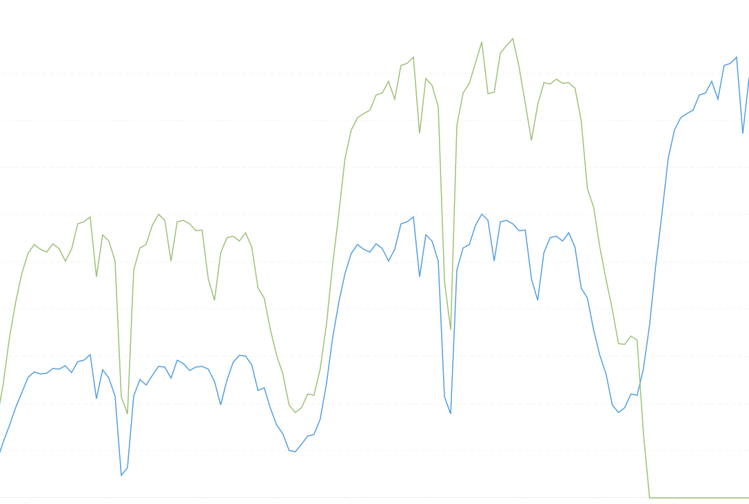
When plotting time series data (or other data too) with Null values on a series, the line chart forces missing values to be displayed as 0 values.
This is confusing for us since we want to distinguish between actual missing data and 0 values. Is there a setting tweak that can be done to force hide Null values on a line chart?
In the example below, is there a way to not show the green series once it falls to "0" (which are actually NULLs)?
It’s been 4 years. This is an important issue can lead to very incorrect interpretations of data. Have you (or anyone else reading this) found a solution?
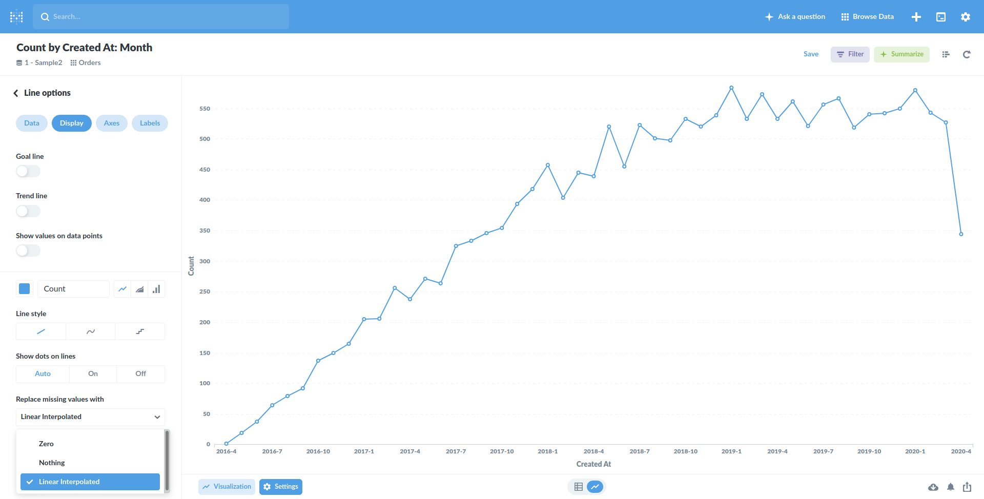
However, I don't see this option (see screenshot below). Is it not supported for SQL queries (against Postgres)?
We're on version v0.35.3 (built on 2020-04-21). I looked through the release notes to see if it this is an issue that's been fixed, but I can't find anything related to it. If it's fixed in the latest version, I can request that we update. Do you know if that's the case?
@bfelbo Click the arrow down to display settings for that series. If you don’t see any, then it’s likely because you’re not returning correct casting in your SQL.