Hi everyone,
Currently my metabase dashboard mobile view looks like this
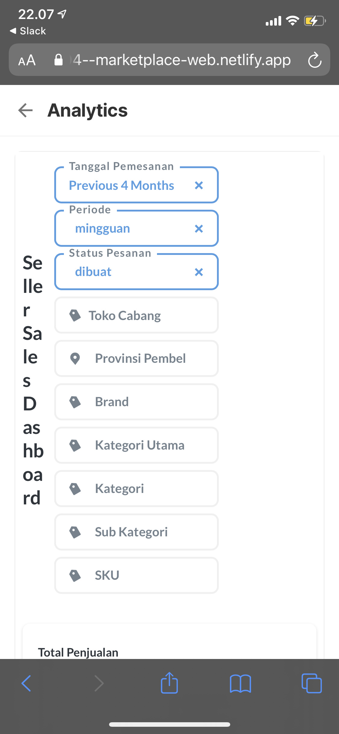

IMO the:
- Dashboard title vertically rendered is a bit ugly (better if it’s horizontally rendered just like common horizontal title)
- the card component is too big (even for single value summary insight)
- Filter vertical stack to bottom is eating too much space (would be nice if there’s an config to make it horizontally stack)
Is there any way to improve these 3 points?
Thanks!
 on the first post of each: