Overlaying Bar Graph Instead of Stacking Bar Graph

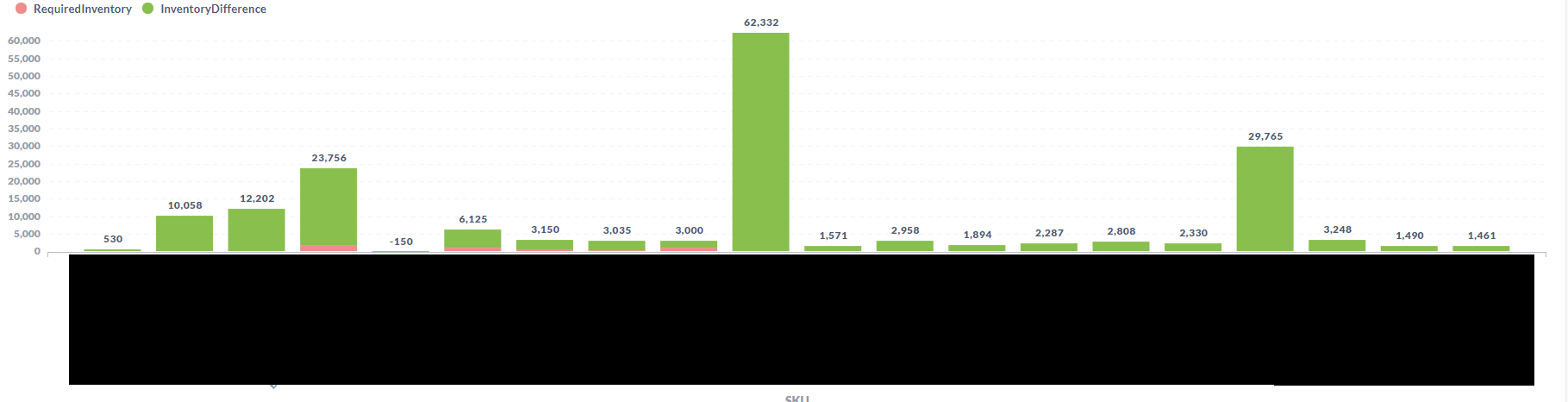
I've got a graph I'm trying to make in which we have a set of products. For each product we have current value, and a minimum value. We'd like to lay them over each other, in order to visually demonstrate how far away we are from the minimum value. The closest I've gotten with the current visualization options I'm aware of is using area. However I'd like to do this with a bar graph instead.

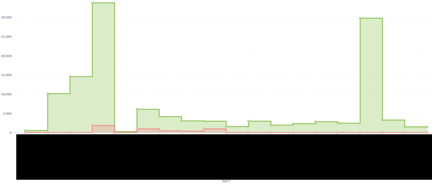
Here is an example of the area graph:

The stacking option seemed like the right one. However it is adding both values, rather than overlaying them.

Does anyone know how to achieve this?

Hi @nick-sbp
Change the "Stack chart type" of the Area chart:

That is still stacking them rather than overlaying them. What I'm trying to do is have the smaller value in front of the larger one, not have the two summed together.

The closest I've come is this:

Where I'm representing the top half as a difference. Using the show value on data points to act as the full value. The problem is that it makes the key and hover information confusing.

@nick-sbp Okay, Metabase does not support what you’re trying to do. Closest is probably Scatter, which allows overlays/overlaps.