Is there a way to paginate the contents of the row graphs?
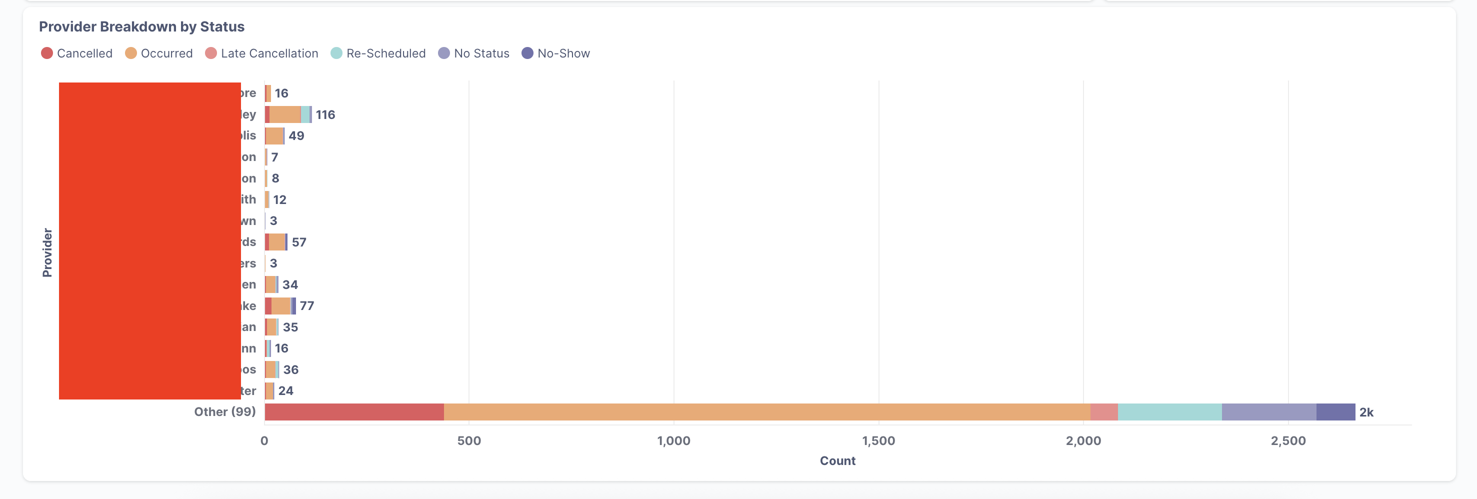
I've attached an example. I have a graph that displays stacked rows for appointments data for providers. At the bottom, there's a very long bar for 99 other providers, but ideally what I'd like to see is the option to see the next page of providers.
I don't think there's a way to paginate a chart in Metabase explicitly (someone correct me if I'm wrong).
Is the category axis (provider) sorted in any way? If so, especially if sorted by a number, it might be possible to attach a Greater Than or Less Than filter to it so you can move the viewport around.
You can implement it with a SQL query-based question using a variable/filter that is feeding a LIMIT/OFFSET clause.
In the short term, you can click the question title to open the question full page, which will expand the chart. You can also click the table/viz toggle at the center bottom to view the raw table.
I can't rely on this method, as I am trying to embed the dashboard using static embedding. I can try to use your other suggestions by using the limit/offset clauses, but the user experience for that is really not great.
Unfortunately there doesn't seem to be any plan to fix this issue in the near future, as they weren't able to provide a timeline, and it's not on their roadmap.
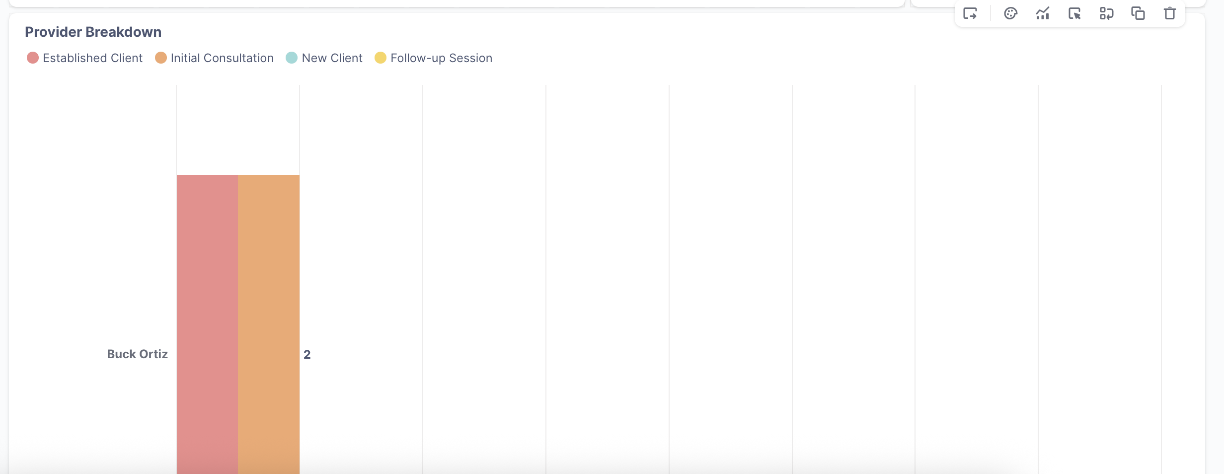
Their only suggestion was to stretch out the graph to be taller, so you can show more rows. Unfortunately, this leads to another issue where, if you have filters turned on on your dashboard and the graph returns only a few results, you'll end up with an even worse user experience where the bars are stretched to fit the height. Screenshot with example:
There are only three rows in this graph, but hard to tell at a glance because they're stretched vertically.
There is also no way to configure the row graph to prevent the stretching from happening.
It's honestly very surprising that there doesn't seem to be any way to scroll through the results, or any sort of pagination. The only graph type that seems to support pagination are tables. Are there really no other Metabase users that have come across this and don't find this to be a massive usability issue?
The bar stretching is because of Auto Y-axis Scaling, which can be disabled, but then you have to manually set the minimum and maximum values, and series with out-of-bounds values get clipped to the edge.
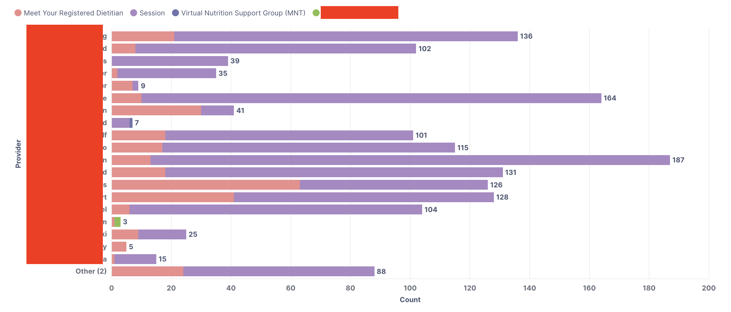
I would argue that if you feel you need pagination, then you actually need to reevaluate your choice of visualization. Take the image in your original post. What is that chart trying to say? Even if Other was gone -- if a provider's bar stretched all the way across the page, what action do you take?
I feel that a table is the correct visualization for the data that you're trying to present there, perhaps with some conditional formatting to call out especially large values.
A chart showing the proportion of successful to failed appointments would be more useful as a graphical element, in my eye.
On a related point, I want a checkbox to disable the Other category, especially on bar charts. Most of the time it's a dumping ground for irrelevant data. I build SQL queries in my dashes to limit the number of data series to keep Other from appearing. You can't drill down through an 'Other' category anyway, so it's useless for it to show other than to remind you that, "there's other data here you can't see, don't forget about it!"
Other on pie charts is actually useful and I have no problem with it there. Sometimes I have to micromanage the cutoff %, but there's a knob for that.
Our customers like seeing this graph because they can see all the providers for their organization, and see which of their providers are booked most often, and for what type of appointment. Having it as a row graph makes it very easy to compare counts between providers.
I could try to see whether a graph could potentially achieve the same thing, but I don't think it delivers the same information.
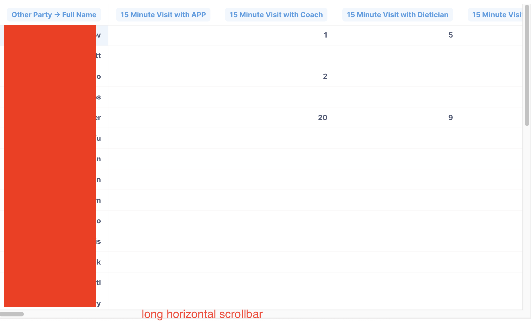
I just tried a table view. Is this what you meant? I think in terms of usability it's worse, because for customers that have many different appointment types, you'll see a lot of empty cells because not all providers will do the same types of appointments. Here's an example:
Thanks for taking the time to put this together! Unfortunately we've decided not to move forward with this change - it doesn't fit our current product direction around how we add visualization settings to questions.
Pretty disappointing because this is quite the usability issue, and Metabase team don’t have any suggestions/workarounds.
If you need to compare lots of values use a table visualization that has a little visual sparkline on it. Check on the settings. Row charts were not meant to do massive visual comparisons, at least not in metabase