Hi everyone,
I'm new to metabase and currently trying out the possibilities of the tool with "Northwind" sample database.
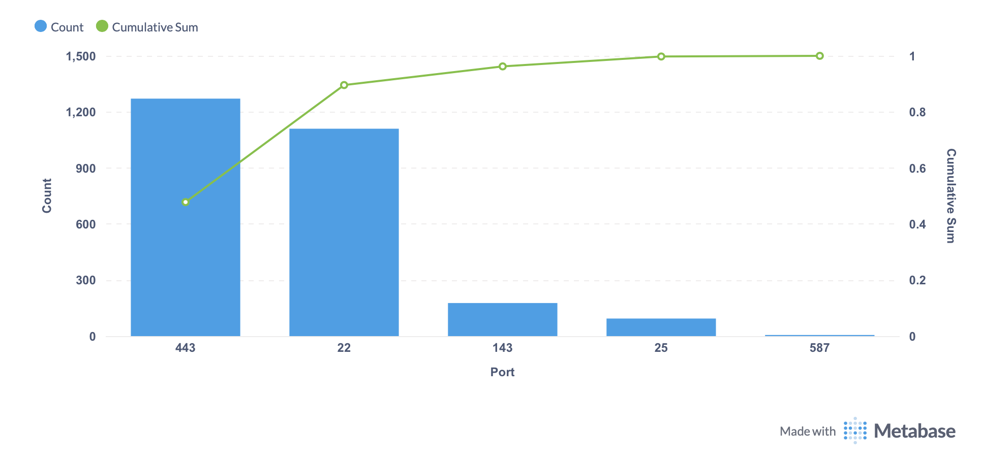
I tried to create a Pareto Diagram with Metabase Query. I wanted to have the total sales per customer on the bar graph and the cumulated total sales procentage on the line graph. Unfortunately I'm not able to create this kind of data set using the Metabase Query. I managed to create it using SQL Query, but maybe I missed somethink?
Is it possible to get the necessary dataset with Metabase Query?
Thanks in advance!
This was a good puzzle to work on.
I don't think the built-in query editor can do this. You need to calculate the cumulative distribution, and that needs a running sum or count and the total sum to calculate. In SQL you have window functions to calculate those and it's easy and performant, but the query editor doesn't have sufficient control over window functions to do what we need.
(EDIT: Metabase has cumulative sum and count custom summary expressions that generate window functions, but there isn't enough control over it to run the window function as needed for this purpose (keep ending up with SUM(SUM() OVER..). There's also the problem of needing a second query to create the total, and there's no way to join that into the main query without a "on true" join operator.)
If you have the cumulative distribution and just need to composite the chart, use the Combo chart. Plot the metric as a bar and the cumulative distribution as a line. You can either place the metric and the cumulative value as separate columns/series in the input data or use the visualization editor in Dashboard set to Combo chart to combine two separate questions/models.
The key is that the two series need to share an X-axis. Metabase will split the Y-axis labels for you. (Pro Tip: Don't turn off the Y-axis labels if you want them, there's a bug where they don't come back if you do. Change the titles in the Data tab if you need to.)
1 Like
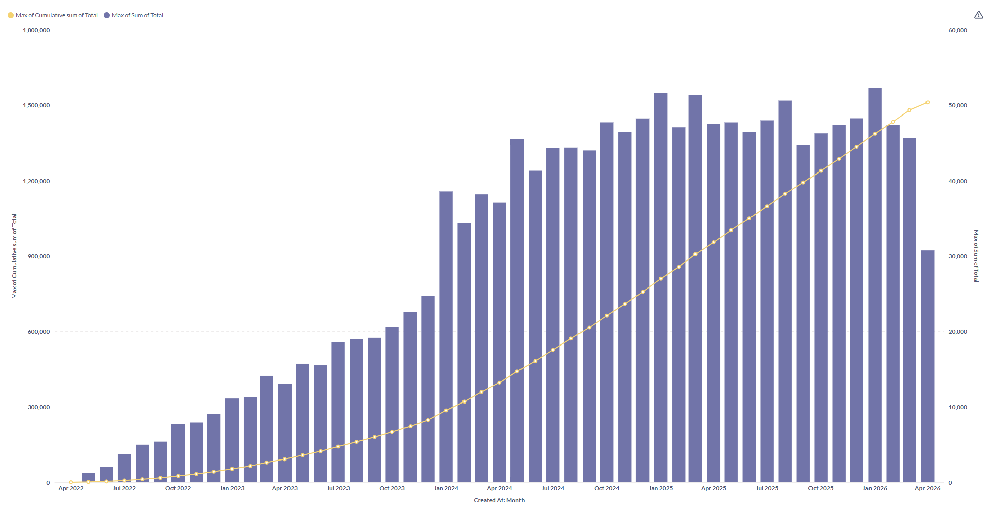
Like this? I've not done the percentage calculation bit, but shoudl be easy enough to do that by joining to a model.
Pareto Chart definition
You don't usually use this type of chart on time series.
You need to sort by the metric descending. The line curve should cumulate the % of the sum of all the metrics, in other words, (rolling sum)/(total sum) for each x.
Here's a basic version in Metabase charting:
1 Like
Hi,
Thanks for the answer.
So in the end the SQL query is the only option.
Shame but good to know the limitations of the Query Builder 
The more I think about this the more I think there is a way with multiple questions and the dashboard combo chart assembly feature, but it'd be a maintenance nightmare and performance would be horrible to boot, especially for large datasets.
In the time it'd take to put together, you could write the SQL query and it'd outperform the glued-together monstrosity by several factors, so in the end it's not worth it.
1 Like
Update on this topic. Metabase 56 added custom join conditions which solves one of the major problems with generating this type of cumulative percentage. I'll update this post with the procedure once I work it out.
UPDATE: The custom join condition feature solves the second problem, joining the total sum to the query. But to solve the first problem I need control over the window function ordering that Metabase doesn't offer right now. I need to order by the value being summed, not a breakout.
The existing design uses the sort order of the latest breakout for the window function but won't let me output the category column too. It is treating cumulative sum more like a standard aggregate function than a window function.