Hi there
how do i change the font size of Pie chart value
Regards
Jayanthan
Hi there
how do i change the font size of Pie chart value
Regards
Jayanthan
hi there
Can we change to pie chart from donut, please advise
Regards
Jayanthan
Nope. Not as far as I know – for both of your questions.
Also with the data you have at hand I would pick a different visualization type - e.g. a row chart or bar chart. Far easier to compare the relative size of your categories at a glance.
Yes – I know – everybody cries for pie’s (or donut’s for that matter) at first. But for most visualizations with more than just a few groups there are often better alternatives … https://www.google.com/search?q=pie+chart+controversy
</end of rant>
hi jornh
We cant use bar charts for all the charts and it would be nice when we use pie charts for product mix or composition/share.
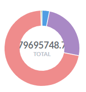
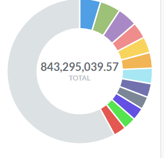
Also its not presentable when values are hidden within donuts. It would be great if we can hide the values.
Regards
Jayanthan
@jornh I’ve worked in presales for a few software companies. Without pie charts, there would have been no demo to give! 
hi all
whats the solution? please advise
Regards
Jayanthan
Use a bar chart?
Hi
it will not show the percentage out of the total(relative to the total)
I was going to suggest a stacked bar, but with only one bar. Sadly, you only get the option to stack the bars if you have mutiple values for all the groups.
Could be worth modifying the pie chart and recompiling. Depends how important it is.
That's a fair point. But I see in your second screenshot that you already found a workaround with enlarging the donut size. I searched for the word "pie" in open issues on GitHub and there's already an open one with a proposed solution to your original issue with that. You can ![]() it on GitHub if you like the solution proposed:
it on GitHub if you like the solution proposed:
@AndrewMBaines yes I know! It’s a lost battle! Anyway thank you for helping to lighten up the tone of voice here. (I was getting a bit into the grumpy corner). So let’s be constructive - and have a laugh at the same time:
 https://eazybi.com/static/img/blog_page/posts/2016_03_01/data_visualization_pie_to_bar.gif
It’s actually not possible in Metabase either at the moment to make that row chart with relative ratios with % shown. So I’ll raise that as an enhancement request!
update: added as GitHub issue #8150: (please chime in as you see fit)