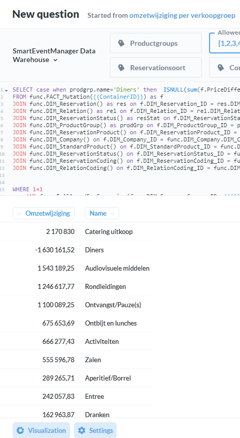
We have a pie chart where one of the groups has a negative value. (see picture values groups dinners) In the pie chart itself the group is not shown. Even worse..the sum of the percentage is over 100%.
Is a pie chart the correct visualisation if you’re expecting negative values? Surely a bar chart would be better? How would you expect the negatives to appear?

 on the first post