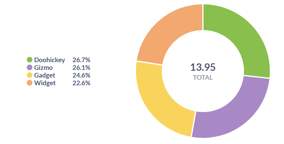
Let's say we do average rating by category, and visualize it in a pie chart. The number in the middle (the total) is summing all the averages, which is misleading. Shouldn't it show the average of all the values and call it "Total AVG"? (since our metric is avg not sum). The same issue applies to the total row of pivot table as well.
1 Like
That's a horrible use of a pie chart. Perhaps Metabase is defending you from yourself?
![]()