mattjur
September 10, 2024, 2:34pm
1
Hi,
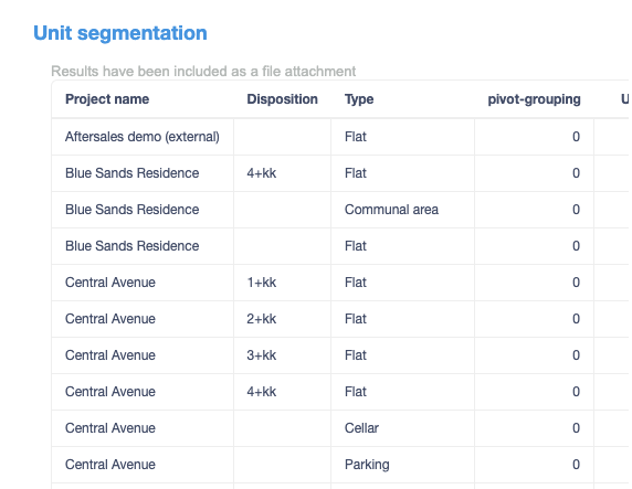
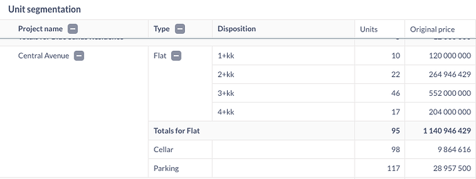
I am trying to send my beautiful dashboard full of pivot tables as an email, but all the pivot tables get transformed into simple tables, making them completely unreadable.
Example:
This pivot table
Is sent like this in the email subscription
Is that a feature or a bug?
P.S. Found this discussion, but not helpful at all as the original topics got lost Different chart rendered in pulse from question · Issue #5493 · metabase/metabase · GitHub
1 Like
Luiggi
September 11, 2024, 1:00pm
2
yes, this feature will come when we move the pivot table chart to the new visualization library, for now you only get normal tables
mattjur
September 11, 2024, 1:28pm
3
Hi @Luiggi , thanks for the reply. Do you have any GitHub link that I could follow to see this happen? Best, MJ
Morten
June 16, 2025, 11:54am
4
Did you manage to get it solved, since it seems like I have the same problem.

