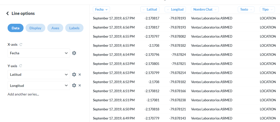
I am trying to plot the same category in the x and y axis so I can visualize it as a 45 degree line.
However, this is the result:

Any ideas of why this happens?
Thanks
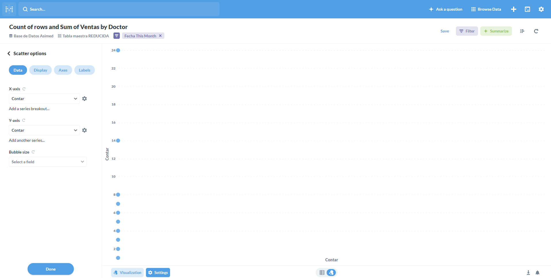
I am trying to plot the same category in the x and y axis so I can visualize it as a 45 degree line.
However, this is the result:
Any ideas of why this happens?
Thanks
Hi @rviteri
That looks like a bug. And I can reproduce with Sample Dataset, but there’s currently a couple of issues that is messing up certain graphs on 0.33.2 - like 10818 and 10840 - so I’m unsure if one of those are going to solve this or not.
Pinging @paulrosenzweig, since he has been working on those issues.
@rviteri
I think that’s a separate issue - possibly one of the two others I referenced or 10862 - there’s a couple of issues with charts 0.33.2, which makes it a little difficult to debug.
Your original scatter plot issue might be caused by one of the three known issues, but I’m unsure. I think you should open a new issue, so it’s not forgotten.