I'm trying out Metabase for our organization. So far we did some reports here and there, mostly using R and ggplot tied together with rmarkdown. I'm quite impressed, it works really nicely, especially since I think it would take some work off me. And my boss loves it.
But when trying to reproduce some of my graphs that people found useful I'm missing one feature. In R/ggplot I can do facetting, ie. if I have data of this form (just some numbers):
date
task
used
requested
2019-12-12
align_rna
12
15
2019-12-12
bcl2fastq_lane
100
50
2019-12-13
bio_bloom
50
75
2020-01-01
check
24
48
...
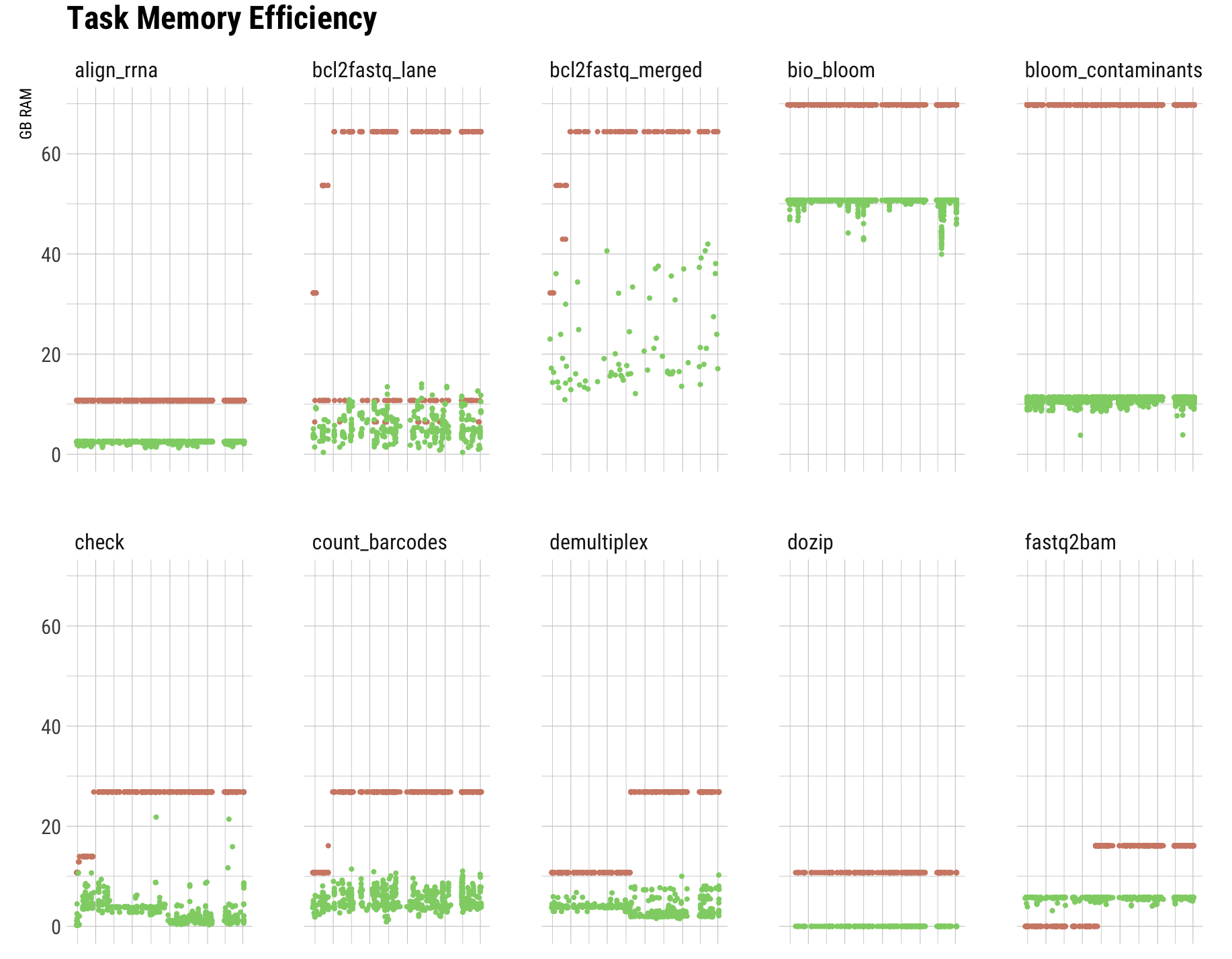
I can split the plots into separate graphs for each task. It'd look like this:
The only solution I found so far was to create different questions with filters for each task in turn and produce separate plots. This is not very satisfying, especially since we've got dozens of those. Also for example in this case the set of tasks is not fixed, so I would have to adapt the dashboard every time a new one turns up (or we no longer use a particular task). Multiply that by a few dashboards and it's no longer maintainable.
Am I missing something fairly obvious? Is there a way to do this with metabase? Or can I somehow add custom plots?
Hi @hekker
I’ve never seen a visualization like that - interesting
Currently there’s no such type - the closest is scatter plot, which probably isn’t quite what you’re looking for.
I can only recommend that you open a feature request, but to be completely honest, unless it gets a lot of traction, then I would keep my hope up too high: https://github.com/metabase/metabase/issues/new/choose
While it’s possible to build your own visualization, it’s not going to be a simple task and you would need to build your own version of Metabase.
It’s really great if you run out of dimensions and/or putting everything into one chart is too confusing; in this case the color is “used up” for the used/requested, and there are 23 different tasks. The development over time is interesting within each task, so the separation does not matter so much (but it’s still possible to see e.g. which tasks use more memory than others, since they’re on the same scale). It’s very much in line with the “small multiples” concept.
Anyways, did I get it right, the only way (or best way) would be to create separate questions with a scatterplot with a filter for reach task in turn?
I could also just restructure the whole thing, with one chart with summary numbers for each task and then one additional detail chart where the user can filter the task they’re interested in (I think I saw somewhere that this is possible). Would make the dashboard less busy, too. But now I’m just thinking aloud here
If your data looks like the little table you showed above, then it would be easy to add filters to that, so people could search dates, tasks and/or the numbers too.
Since it’s difficult to figure out what “hack” would fit your data best, I would probably show the same data twice - as a scatter plot and then the raw table data. That makes it easy to quickly see outliers on the scatter plot, and much easier to dig into with the table.
Then have filters connected to both cards on the dashboard, so it’s up to the user, which tasks/etc they want to see.
Play around - it’s definitely the best way to learn, but the documentation will probably help you too, in case you haven’t seen it: https://www.metabase.com/docs/latest/


 on the first post