Hi all,
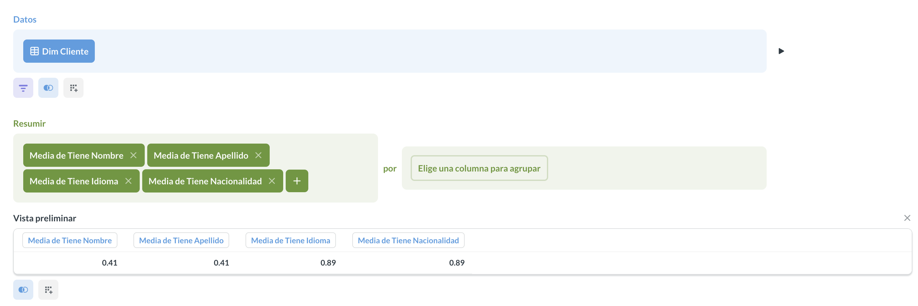
I’m new to Metabase and I’m stuck with what I suppose should be an easy chart. I’m trying to represent the completeness of a customer profile in a bar chart.
X-axis: from 0% to 100%
Y-axis: fields like name, surname, language, country, etc.
My query looks like this:
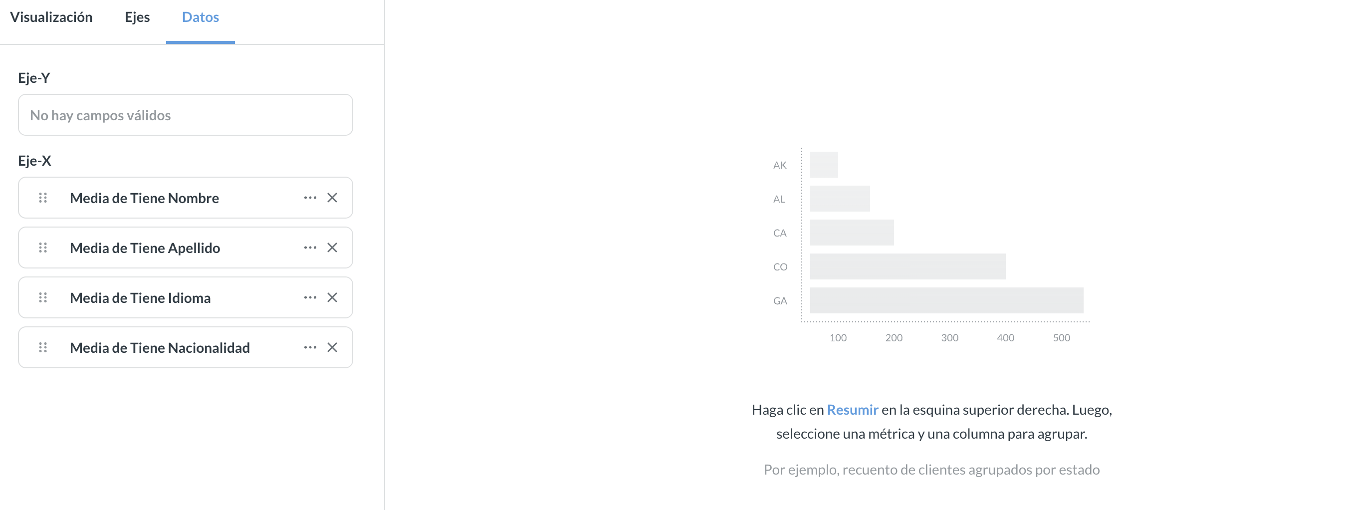
However, I don’t know what else to do, because when I try to display it as a bar chart, I always get this:
What I’m doing wrong?
Thanks in advance.
1 Like
Metabase needs a dimension to plot by when the values are in columns computed with summarizations in the notebook editor. Is there a column you can group the values by, like a date range, even if it creates one group?
A possible workaround is to pivot the values into rows, if you can figure out a way to do that with your data. Metabase can figure out rows in a format like (‘label’, value) and plot them in a row or bar chart. This is tough to do in the notebook editor, though.
Another option is a dashboard with individual Gauge visualizations for each category, which can work with a simple number. You can feed the gauges with the same question, just change the visualization options for the cards to plot different columns.
1 Like