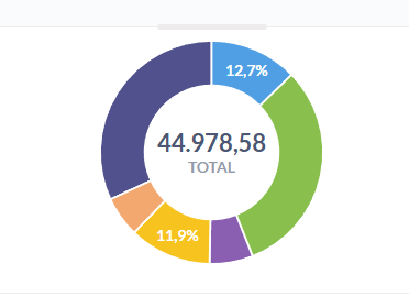
I have a donut chart that looks like this:
As you can see, not all the percentages are displaying. The only reliable way to get that result is to make the chart bigger, and that is not an option given the aesthetic of the rest of the dashboard.
I don’t really understand why this is a constraint, and there seems to be no rhyme or reason as to why some values display and others don’t. Some of those bigger slices of the donut don’t show values while smaller slices do. Am I missing something?