Hi guys!
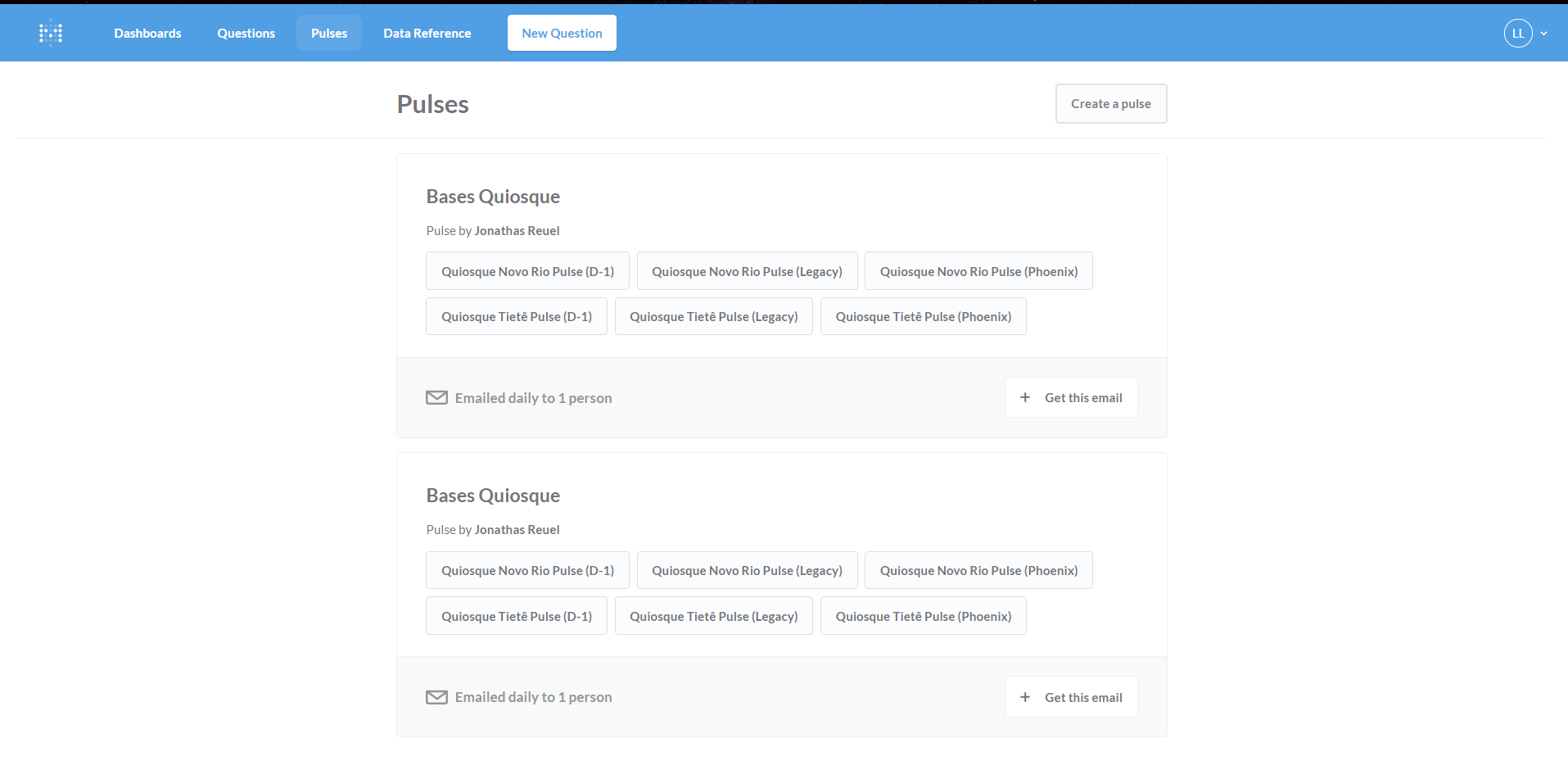
I was taking a look at my pulses, and, at least in my sight, their display is not exactly very clear - I think it is a bit overloaded, so it becomes harder to look at and tell one from another. I mean, sure, you can see the difference between them all and such, but I think it would be nice to have a slight color variation between them.
Something like from
to
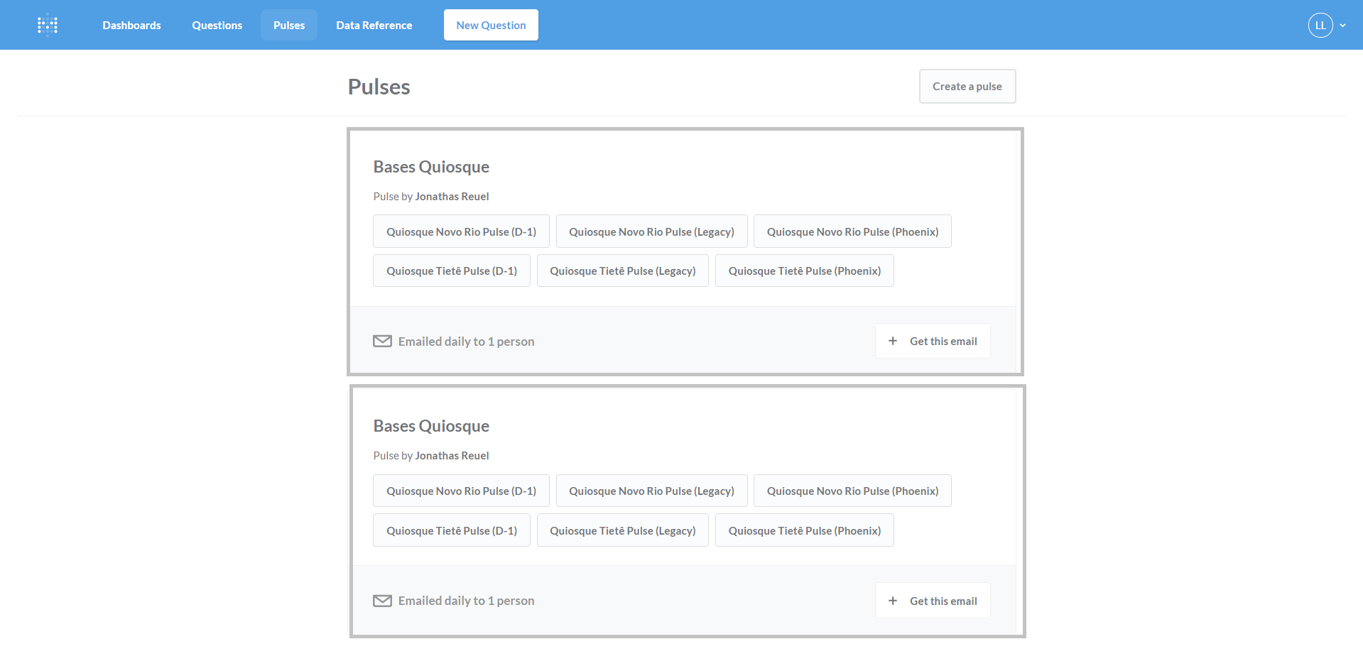
It is obviously exagerated here, but my idea was only to make it easier to distinguish them. If you disagree, well, won't change much regardless, metabase will still rock. I just think it is an easy stuff to change (I think it is just a color code, right?).
Changing or not, metabase for the win!