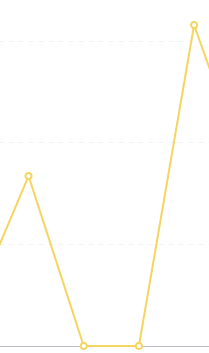
I have a line chart which shows a daily aggregate value. For the chart itself I've set the "Replace missing values with" option to 0. That works like a charm:
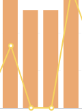
However, when I add that line chart as a series to another chart (a bar chart in this specific instance) then the option is disregarded and the default interpolation seems to kick in:

Is this the desired behaviour or something that I can change? Or should I report is as a bug? (Using v0.41.4)
Hi @ChristophD
When combining questions on the dashboard, then only the original question's visualization settings are applied. This is a limitation of how much data that is pulled in.
So unless the visualization options on the card on the dashboard allows you to change this, then it's not possible.
1 Like
@flamber, thanks for your lightening fast reply.
Okay, that's a somewhat funky behaviour, because it means that I can achieve the desired outcome by adding a bar chart series to a line chart series (which has been configured accordingly) but not the other way around (as the "replace missing values with" option doesn't exist for bar charts).
@ChristophD If you look in the application database, then you'll understand why, since there's no visualization settings for the other questions added. This also causes other problems like https://github.com/metabase/metabase/issues/17943
Got it, thanks. And I'll upvote #17943. 