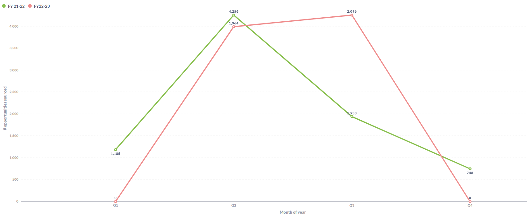
Focus on 4256 in green next to 1964 in pink ( mapped between 3500-4000 value on the y axis)
Hi @SwatiG
Post "Diagnostic Info" from Admin > Troubleshooting.
Look on the right, you are using split-Y-axis. Change it in visualization Settings > Axes.
thanks for the solution. Yes , Got that fixed
The split Y axis has been turned off in visualisation settings .
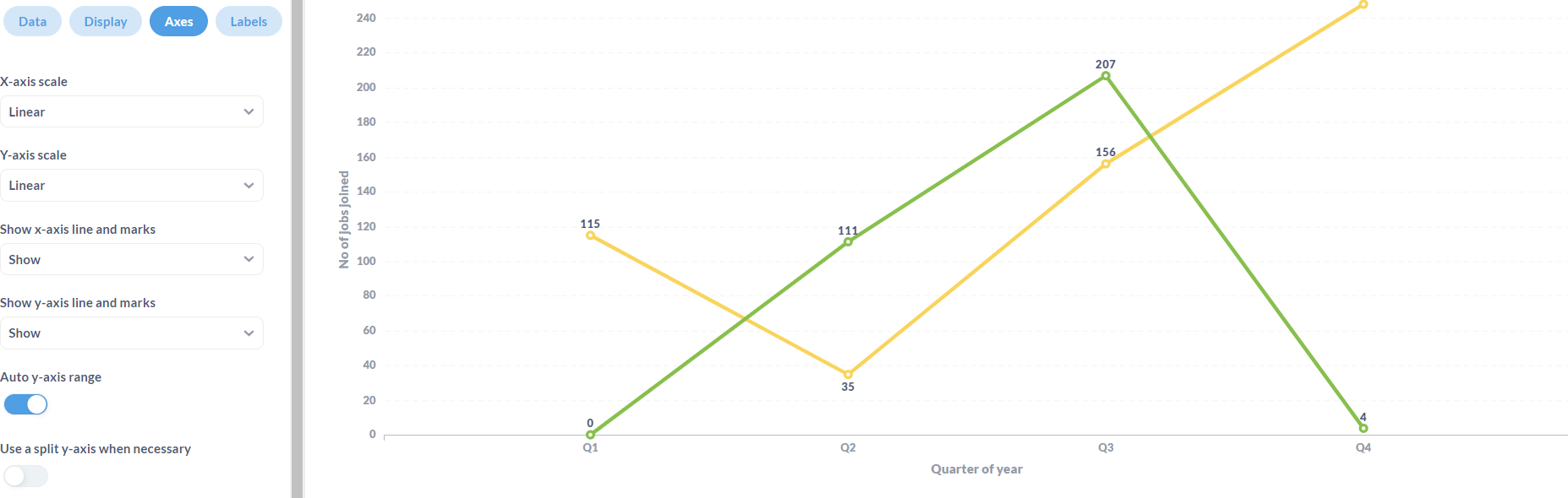
The split y-axis has been turned off even in the original card settings.
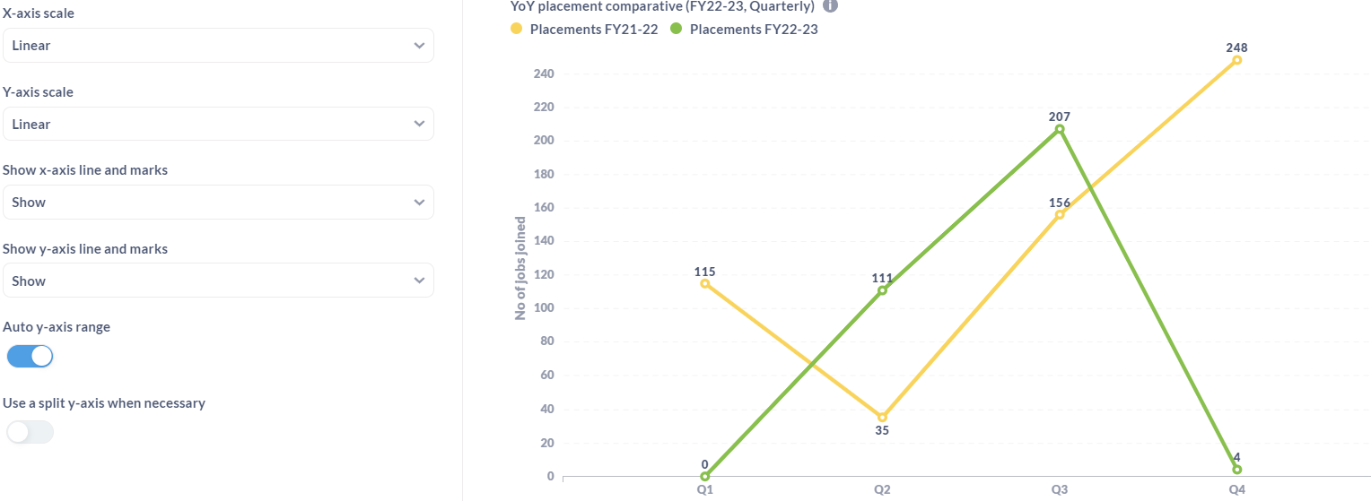
The image in my mail on subscribing for the dashboard where the card is placed. There is a diff in the scale of Y Axis.
Why does the the card in the email not have the same settings ??
Where am I going wrong ???
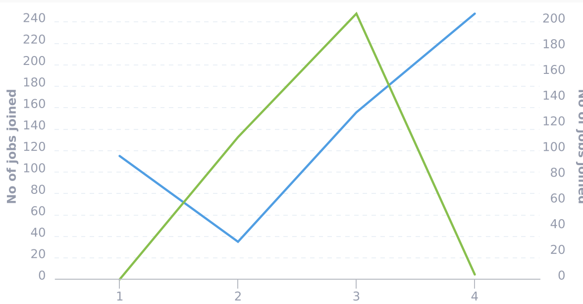
@SwatiG Different rendering engines for static visualizations:
https://github.com/metabase/metabase/issues/20559 - upvote by clicking ![]() on the first post
on the first post