Hey guys, is there any option to send the map instead of the table in the pulse?
I've tried sending a questions to my email, but what i got is just the table.
Is there something I'm missing??
Hey guys, is there any option to send the map instead of the table in the pulse?
I've tried sending a questions to my email, but what i got is just the table.
Is there something I'm missing??
Hey, its just a limitation, seen here
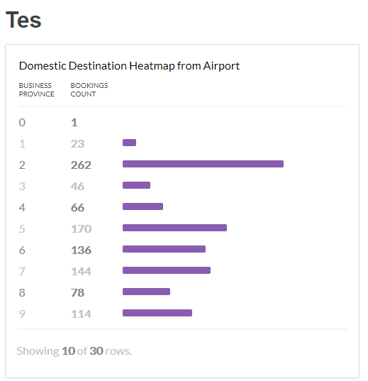
"Currently, there are a few restrictions on what kinds of saved questions you can put into a pulse:
Raw data can’t be put in a pulse
Tables will be cropped to a maximum of three columns and 10 rows
Bar charts (and pie charts which get turned into bar charts) will be cropped to one column for the labels, one column for the values, and 10 total rows"
Oh I see. But ummm, is there an option to turn off the limitation? or the limit will be removed in the next release?
Thanks btw.
Code it yourself ^-^ … as for next release I haven’t seen anything that would suggest this, I would suggest maybe adding your voice to https://github.com/metabase/metabase/issues/5493 (the only ticket I could see related to what your asking)
Thanks Tim 
We are actively talking about revising the way we handle chart rendering in Pules, and the current bias is towards removing the behavior where we transform charts into different chart types, and instead just resizing things down. The initial (misguided in hindsight) approach was based on a desire to ensure that Pulses would remain compact and digestible enough in mobile views, but we agree it’s time to revisit this.