Hi! Is it possible to specify a fixed axis scale for a visualization?
In my case, I have some bar charts showing different data. Placed side by side in a dashboard, I'd like their y axes to be comparable (e.g., have both go from 0-100, not 0 to some auto-selected value based on the source data).
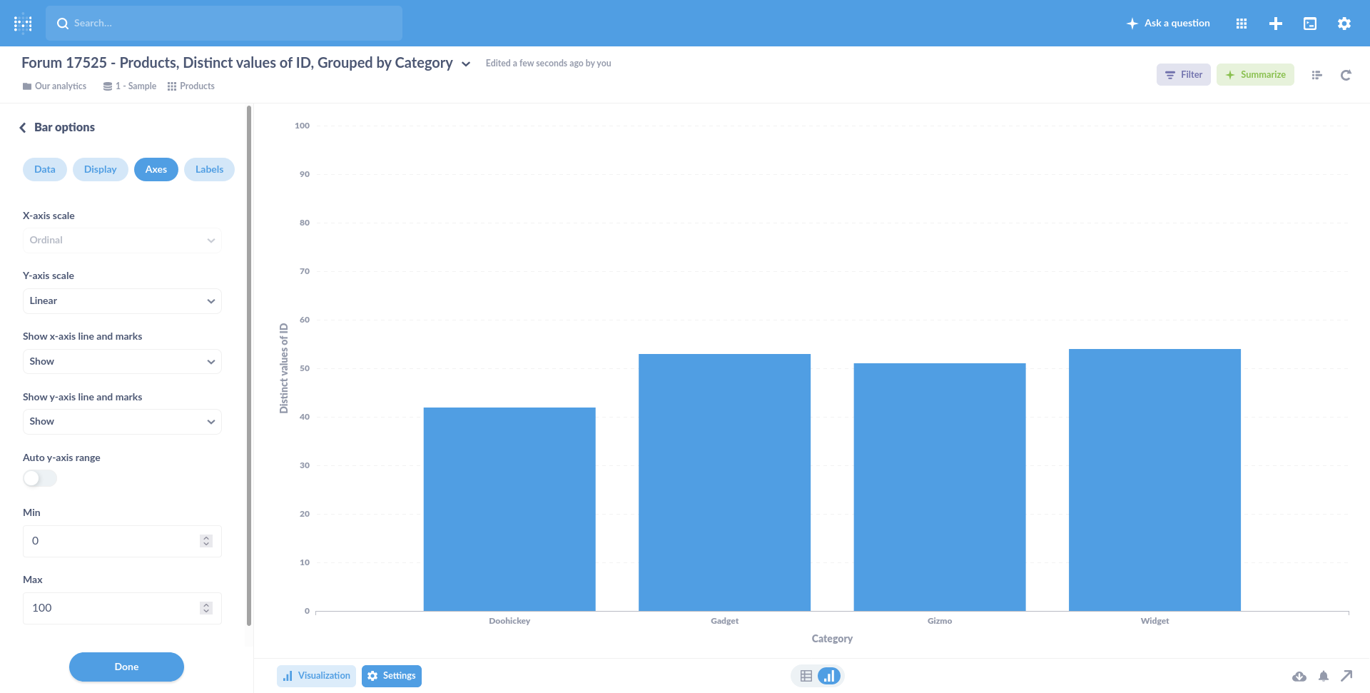
@flamber thank you. I tried disabling "Auto y-axis range" already. That works on an individual chart.
But disabling auto-ranging doesn't let me specify axis min/max values manually. And each chart functions independently. So when I have two charts next to each other in a dashboard, they aren't aware of each others axis ranges.
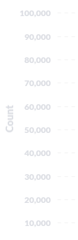
Maybe a sketch will help. On top here, Charts A and B function independently. Note that A's max value is ~100 and B's max value is ~50.
On the bottom is what I'd like to achieve — setting the same y axis range on both independent charts, so I can more easily make an "apples to apples" comparison between A and B.
@smurray
Post "Diagnostic Info" from Admin > Troubleshooting.
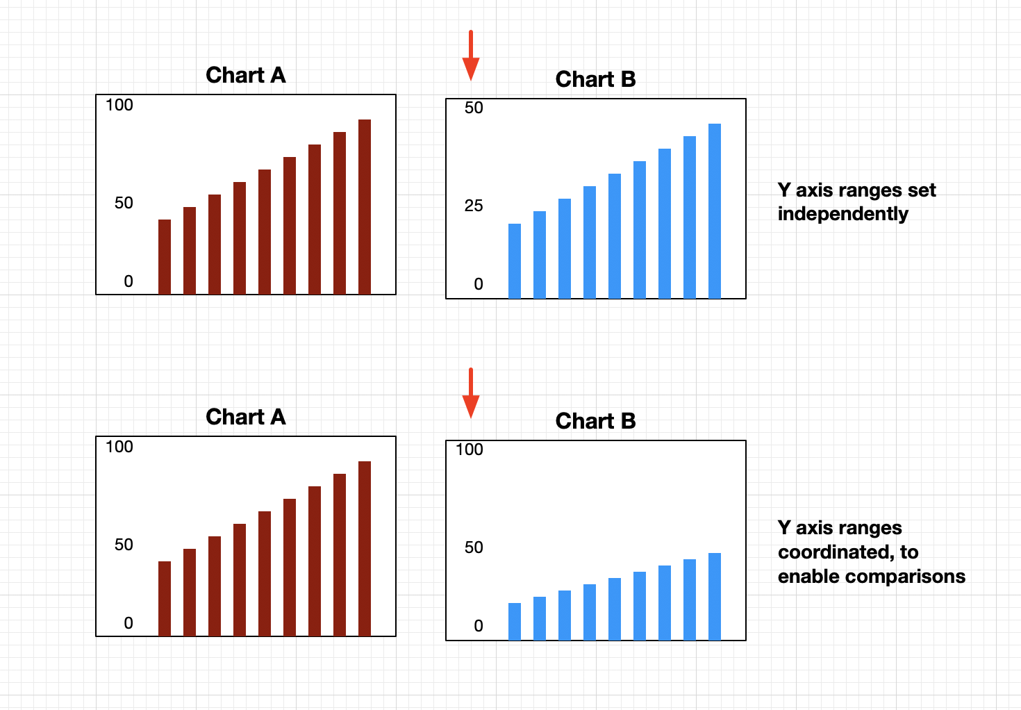
I would highly encourage using the Sample Dataset to try to explain problems, since it seems like you cannot show your data (understandably), but it makes it more difficult to help you.
 🤦♂)
🤦♂)