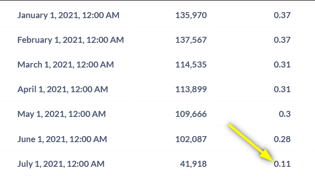
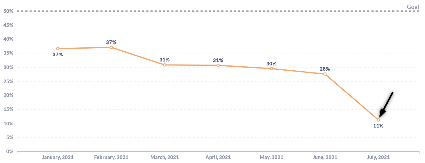
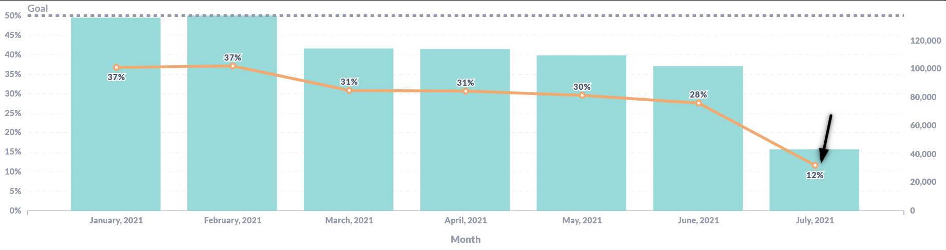
I'm creating a combo chart for month as X-axes and activate show value for series for one of the 2 visualized metrics. It is showing 0 for the latest month (1st pic). The actual value is not zero when I'm using table visualization (2nd pic). It is showing correct number when I remove the other metric (3rd pic). Anyone experiencing the same issue?
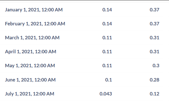
Yap, it seems to only happen when too low value metric and too high value metric were combined in the same chart. For now I divide the high value with some number (within the SQL Query) so the gap between the two metrics were smaller, then I multiply it with the same number on data setting to get it back to its actual number, so far it works fine using this workaround
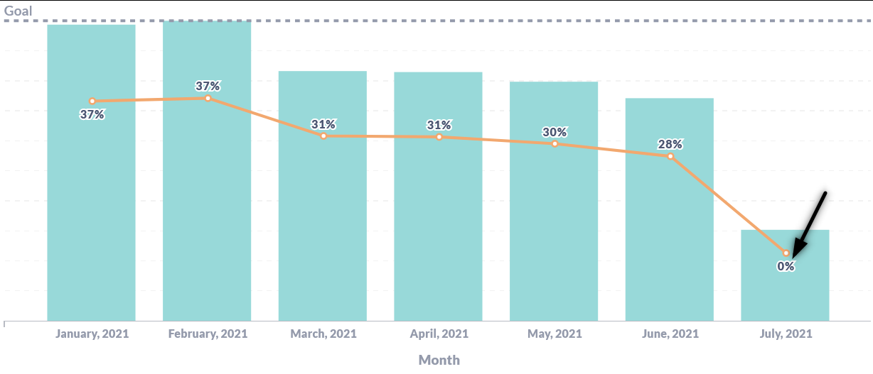
 on the first post