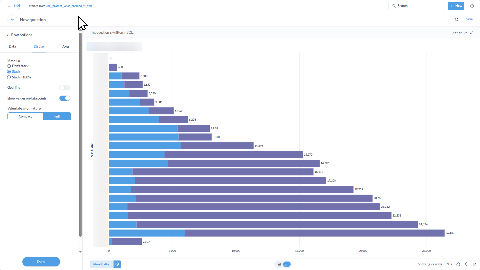
I would like to see support for values in stacked row chart!
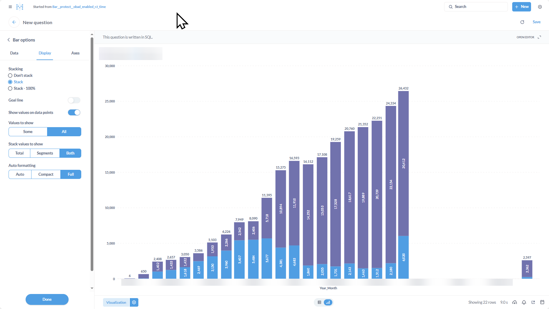
The feature is supported for bar charts, but not row charts. Since the numbers are show horizontally, I think it is much clearer than a bar chart. The row chart also fits into a dashboard more easily.
Thanks!
I am using v0.50.27