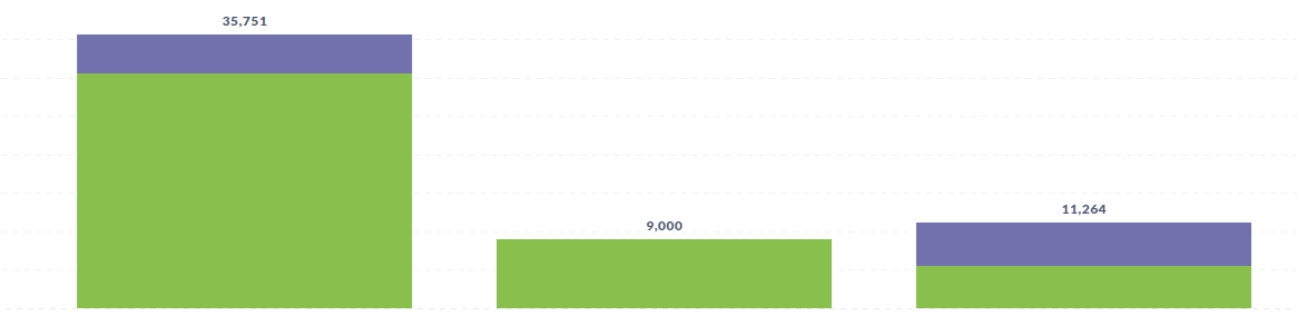
I want to visualize using a stacked bar chart.
My need is to sort according to total X axis data. If you use sort by from count + group by, the results are like this. How can I achieve these needs?
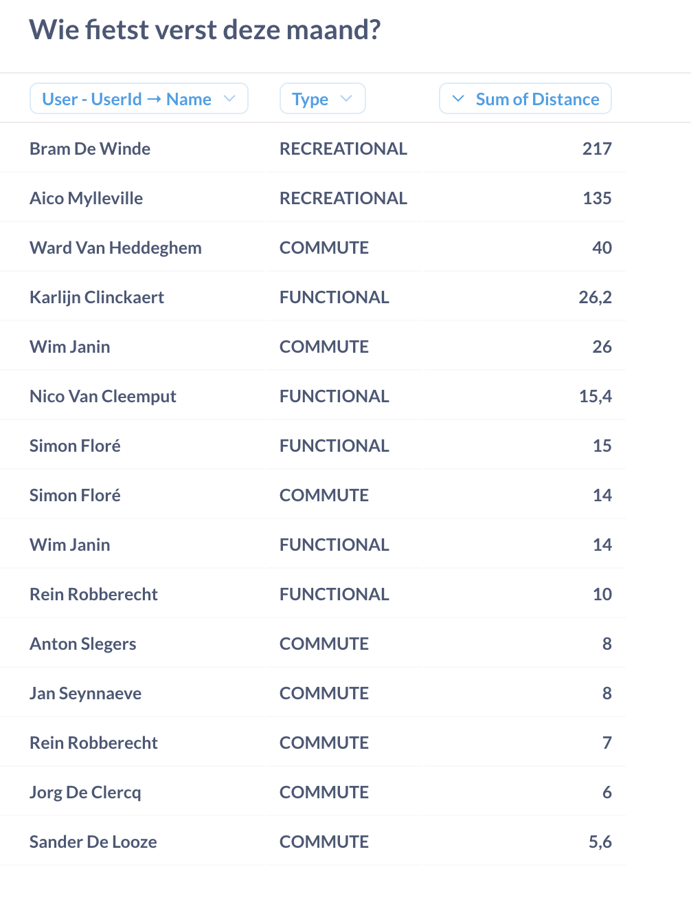
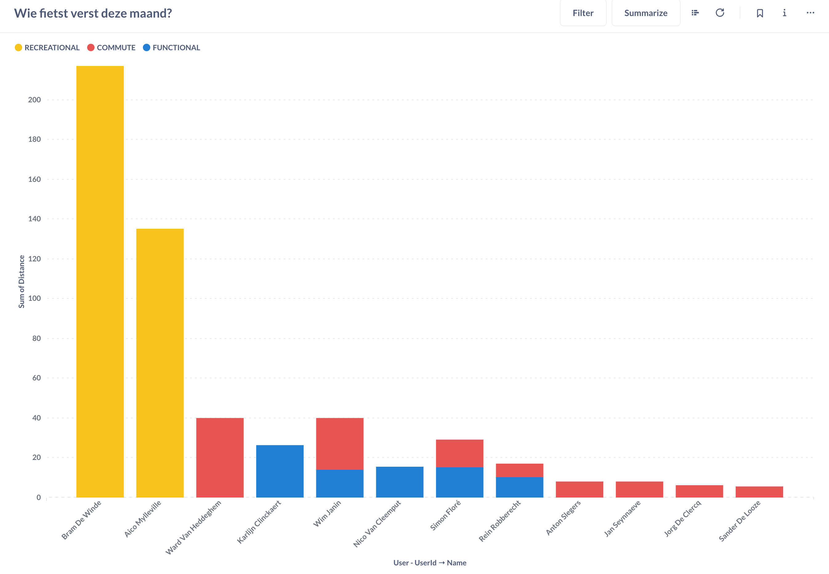
I have the same challenge: I'm collecting bicycle rides distance in 3 categories, and want a stacked bar chart graph, showing the total distance per person, and sorted by their total distance traveled.
How do I sort on total distance?
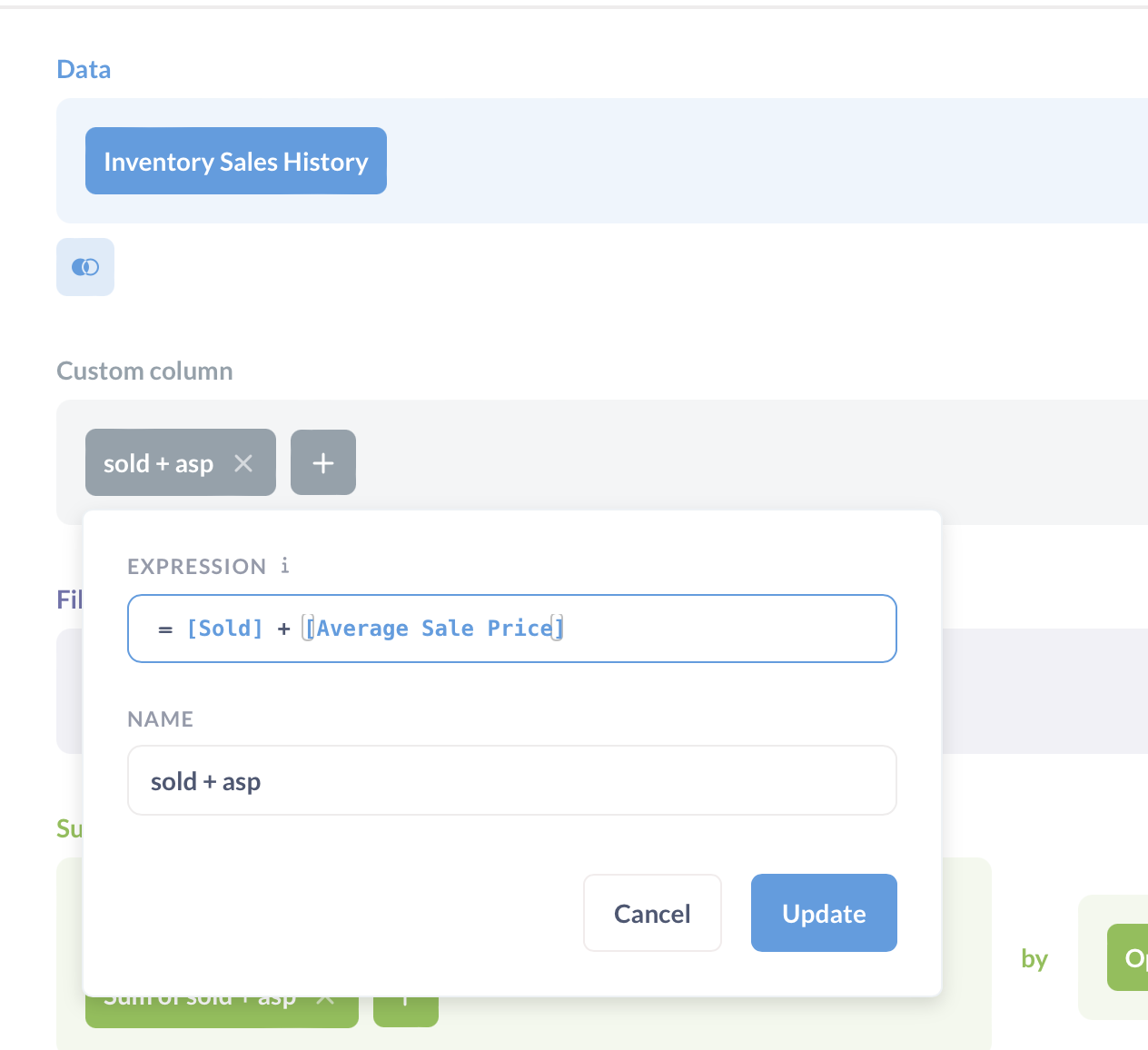
I cannot really use the proposed method, since my distance is just one single field.
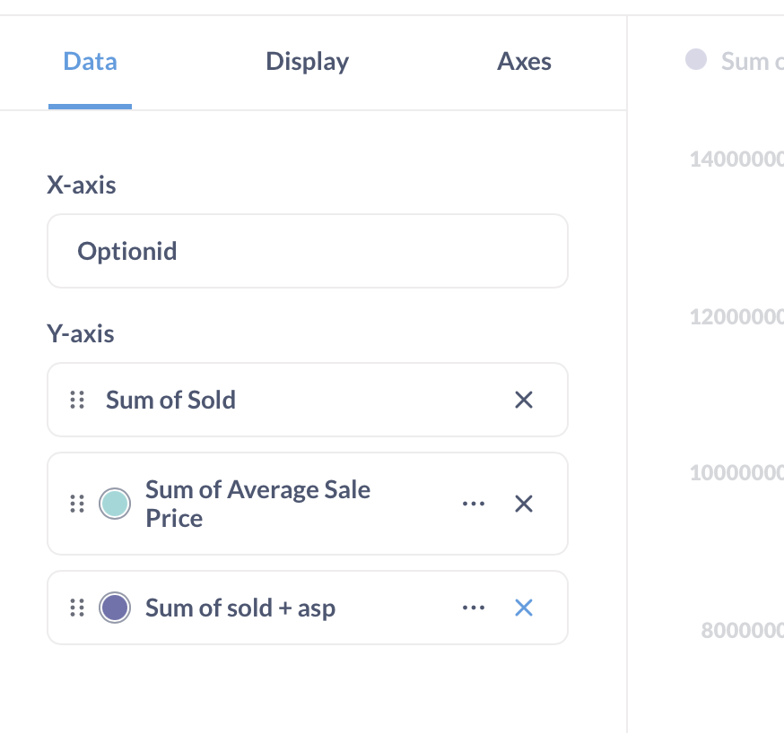
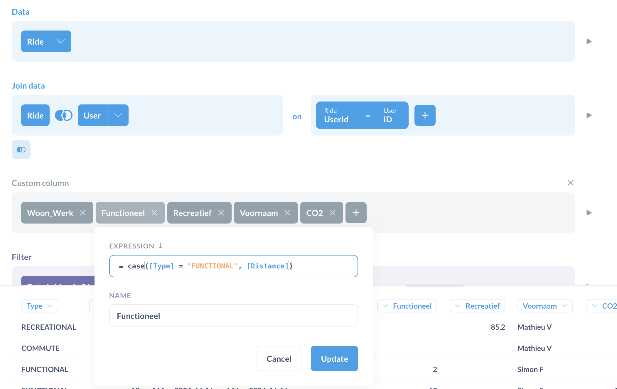
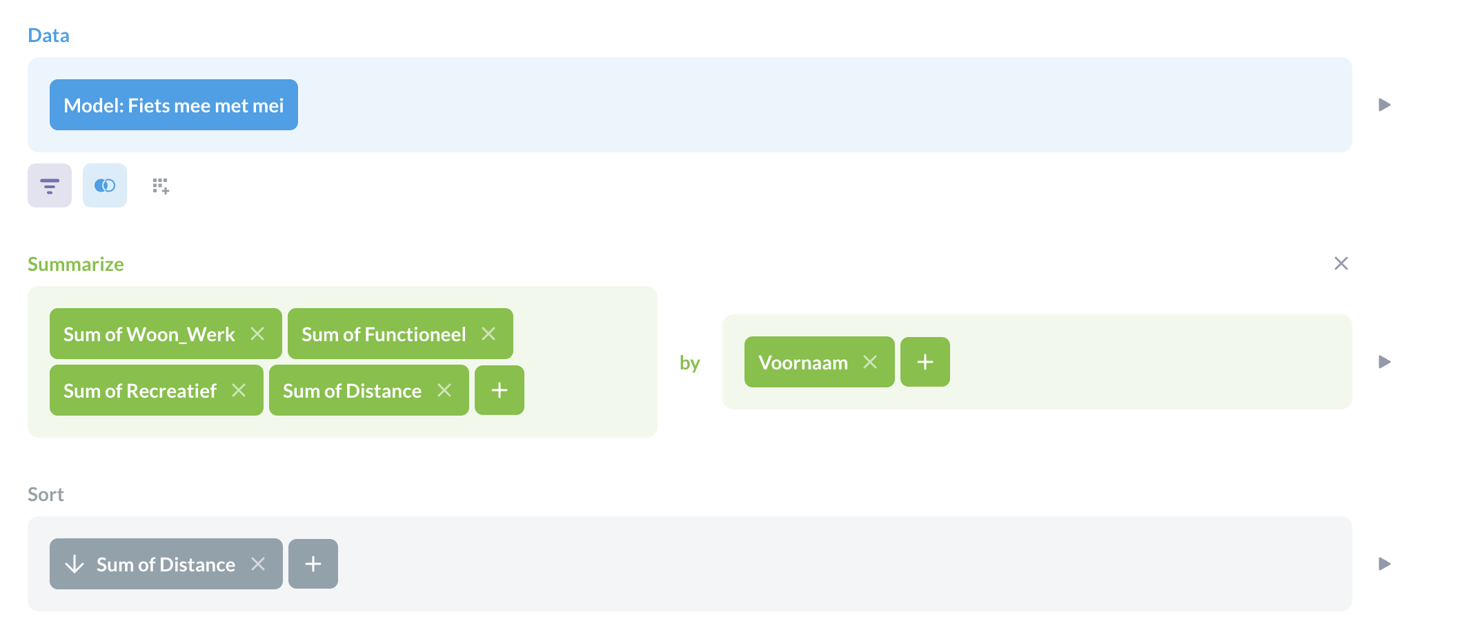
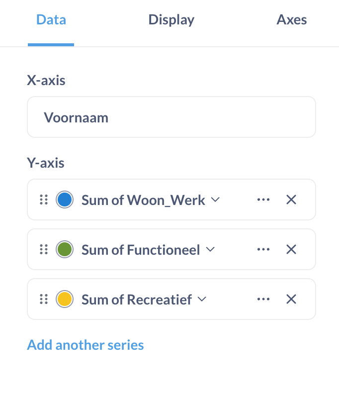
Instead of summarizing by two categories (Name and Type), I created 3 custom fields to be able to SUM each of the distances I'd like to show in the graph: