So I have a question with this data:

Based on it, I made a visualisation like this:

How do I make this into a stacked bar chart, where the bar is divided in two (zero emission field is true/false)?
So I have a question with this data:
Based on it, I made a visualisation like this:
How do I make this into a stacked bar chart, where the bar is divided in two (zero emission field is true/false)?
Hi @saltvedt
Yes, just group by the boolean column as well. Example:
Thanks, this is my settings now:
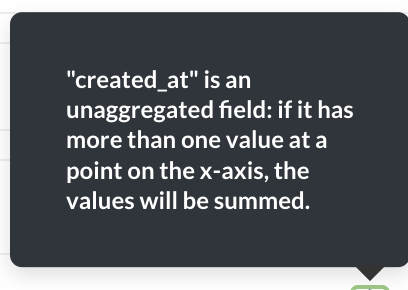
When I tried to group by the boolean field, I get the following error:
@saltvedt Post "Diagnostic Info" from Admin > Troubleshooting.
And show a screenshot of your X-axis configuration.
Thanks, adding another field to the X-axis worked 


