Hi,
I have issues regarding the subscription to a dashboard. When displayed by email or on slack, the questions are slightly differents compared to on the dashboard. For example, there is no more compact formating for the values to show, the pie chart normally sorted by the legend is now in disorder, or a stack to 100% questions is now displayed as don't stack... Is there a way to fix that ?
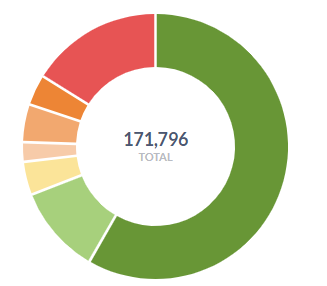
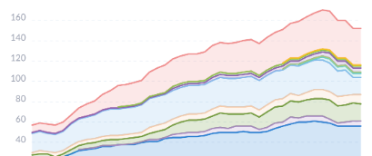
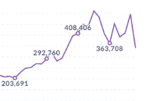
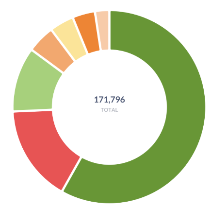
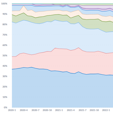
Not yet, as the subscriptions are generated on the backend and not the frontend. The charts won’t look the exact same unless we rewrite the entire subscriptions codebase