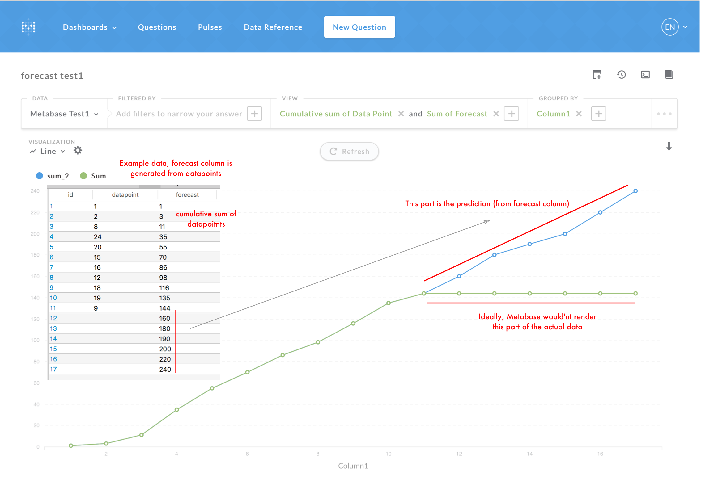
I have a usecase for visualising predictions in addition to the actual data. For example: we want to draw a graph that shows the total amount of users and we also want to draw it n months into the future using something like Facebook's Prophet.
One way to accomplish this would be to generate data into the future and just graph that. However, the UI would'nt do a very good distinction between "this data is real" and "this data is forecasted" (unless, maybe draw two lines where the other one is the forecast and starts from where the other ended?)
Another way would be that metabase supported having two separate queries from two separate data sources in the same graph (AFAIK not possible atm.).
I have enough time and clojure skills to dig into metabase's sources - however, I'd like to hear more from experienced people. What do you think would be a good way to do this with Metabase?
ps. I'm also looking at Grafana for this as they can support this.
EDIT:
Here's a picture that hopefully clarifies what I'd like to accomplish.
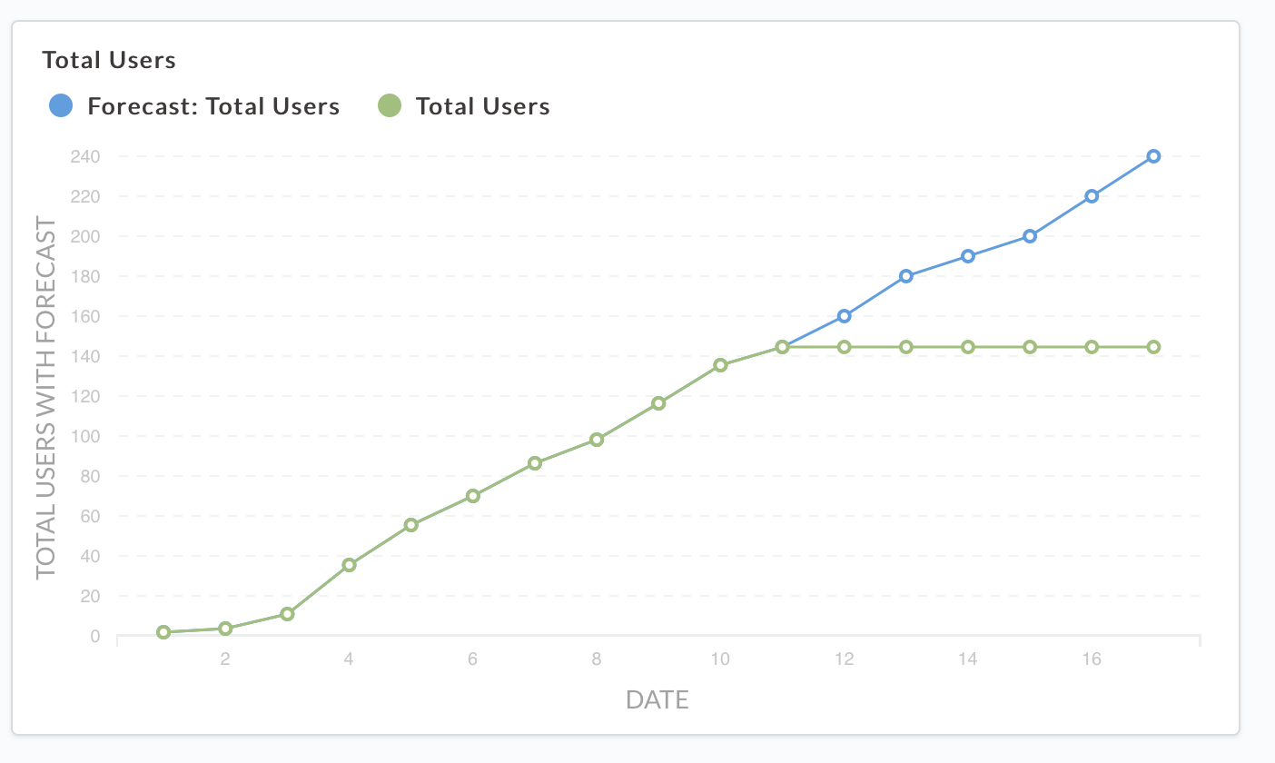
Could you please share how you calculate the forecast data?
I understand how metabase can overlay current and forecast series - but where does your forecast series data come from?
Clearly this would require a predictive modelling engine to enable the predictions, but it would be very useful to provide to business teams or anyone to be quite frank, the ability to see what the future MAY look like.
The quality of the prediction would need to be managed via variables in the data. But it could be manually tuned by the user.
You’d have to use historical data to predict the future trend.
Eg: if user growth was D0 - 0, D1 - 10, D2 - 20, D3, 60- D4 -200 etc etc you could predict that day 5 would be 500 or so etc etc
It isn’t supposed to be accurate, its supposed to provide some “predictive” functionality to help with data analytics better.
The point of BI tools is to help make better informed decisions. And while historical data is not the perfect data set, its the only one that exists in a tool like this that would be useful.
Technical a similar feature already exists - the trend line - on graphs which I would assume would take a similar, albeit more rudimentary approach.
 on the first post