Hey everyone, how's it going? I need some help.
I have a table with 40,000 rows of data, where the data for each row is generated approximately every 10 minutes. The date and time when the data was generated are stored, for example:
2022-11-26 00:10:00
2022-11-26 00:20:00
2022-11-26 00:30:00
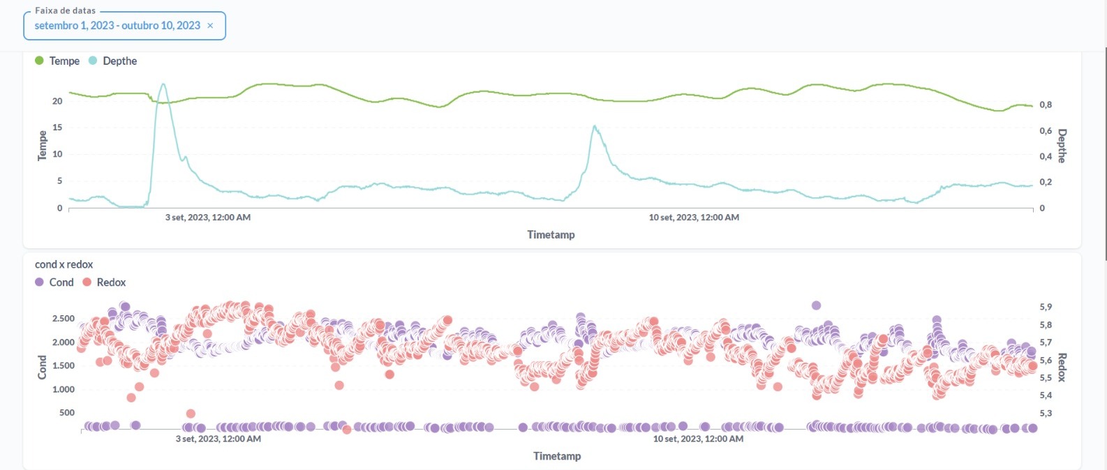
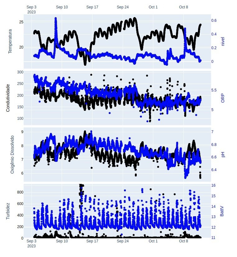
The table has 14 columns with data that need to be compared. However, there is so much information for each date that it becomes challenging to display the dates I want to show on a line chart because there are too many of them. I have an example of how it should look and an example of how it currently looks. The importance of these charts lies in visualizing the curvature during specific periods and not in displaying a large number of values.
any idea?
Thanks everyone
att Matheus.