I am attempting to create a line chart that displays some test data. Each data point has timestamp for the x-axis value, and a integer value for the y-axis value.
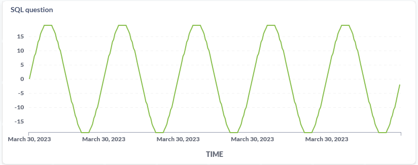
Each data point is approximately two seconds apart. When visualized as discrete points, the graph should look like a sine wave.
I would like to create this chart in Metabase. However, when I "Summarize" the data, I don't see a way to chart discrete values. Furthermore, it appears that if I choose to "Group by..." time, the lowest granularity of time I can choose is "Minute".
Can I chart discrete values? That is to say, y-axis values are not summed, averaged, etc?
Or, alternatively, is there a way to reduce the x-axis granularity to second?
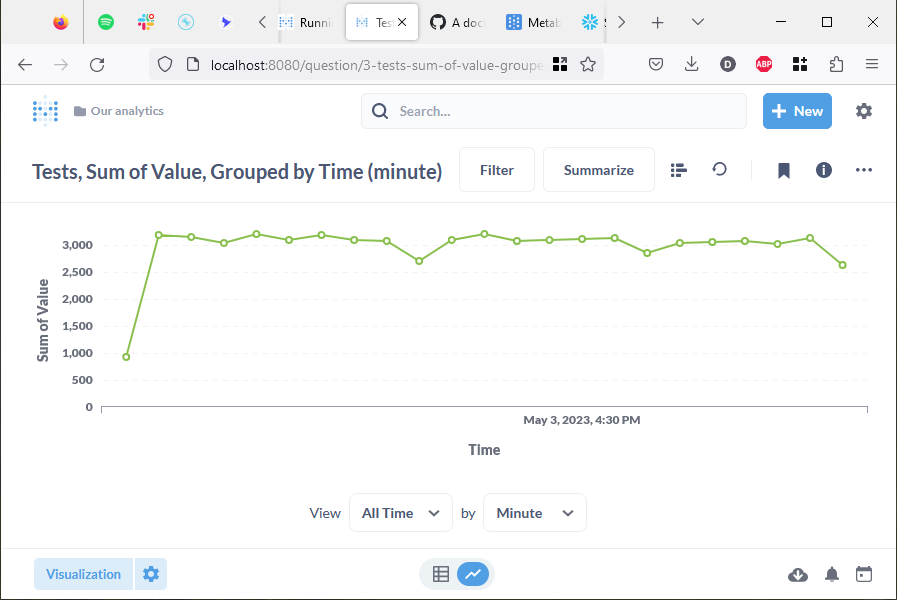
The resulting graph I created so far doesn't look anything like a sine wave (which is the correct display of the data).
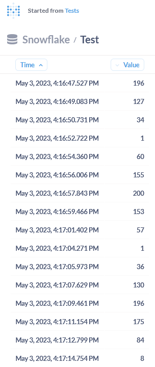
See sample data below. And the chart I created in Metabase that I am hoping to improve.