Hi,
I use bar charts a lot as they are easy to read for my users. When I leave the x-axis on "ordinal", the graph looks good but the x-axis description overlap and is impossible to read:
Is there a way to have the best of both worlds - e.g. having proper bars even when you define it as time series or having only a few of the descriptions on the x-axis to make it readable even when the x-axis is ordinal?
As I had to change all the bar charts to time series to make it look good again I assume this is new in 0.25.1 as the ordinal graphs looked good when I created them a few versions ago.
Hi,
I'm very glad to write my first message in Metabase Discussion.
I would like to extend the topic asking if it's possible or not to rotate form horizontal position to vertical position labels X-axis in order to see all labels X-axis ?
You cant rotate currently - but a design for it has recently been created on top of a newly created issue … so looks like it’s in the pipeline somewhere …
Hi, I have created a time series graph. Set the X Axis to Date. “Ordinal” is selected by default and disabled. However shows each date leading to too many data points (similar to bar graph shown in this thread)
May I know how to set X axis values to say only Months or Years etc. but still show all the time series data in the graph.
From this thread, i realise the issue is resolved, but could not figure out how to set up. Pl guide.
Please post “Diagnostic Info” from Admin > Troubleshooting.
If “Ordinal” is the pre-selected option and it’s disabled, then it’s because you’re returning strings or another non-date type. That’s probably what is causing the problem.
There’s currently no way to make the formatting on the x-axis ticks different than the data value points.
Thanks for prompt guidance! You are right, possibly its a string issue. Will try with proper date format. Am assuming if X axis receives a date column, it will allow to select “Time Series” option. Through which I can set, say, months.
Am new to Metabase. Just to clarify about Diagnostic Info - you wanted me to copy/paste the diagnostic details from Admin so that you are clear about my environment / version etc. ?
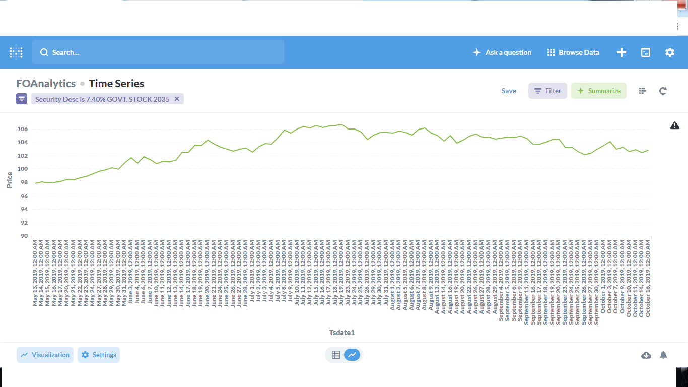
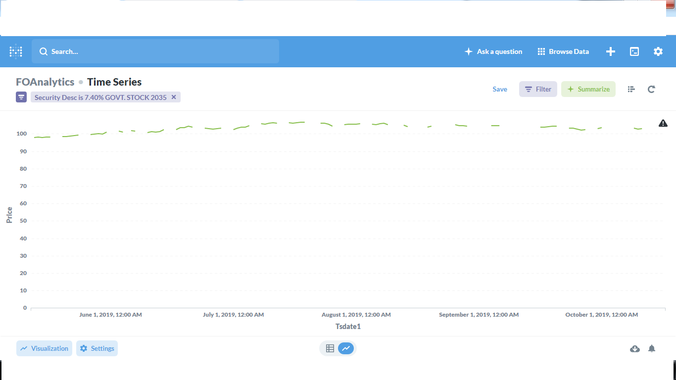
Resolved the Date issue. TSdate1 is a date column.
1st chart - X Axis set to Ordinal - graph is fine, but too many values in X axis
2nd chart - X Axis set to TimeSeries - graph not ok (ignores the Y axis range I set). But X axis intervals look fine.
How to get both a proper looking chart and proper X values ?
Sorry if this is already answered earlier, tried searching, but could not locate.
@Krishna
I would guess that you don’t have data between some of the points and have set the visualization setting “Replace missing values with” to “Nothing”.
You have way too many data points to be able to show all the x-axis ticks.


 on the first post