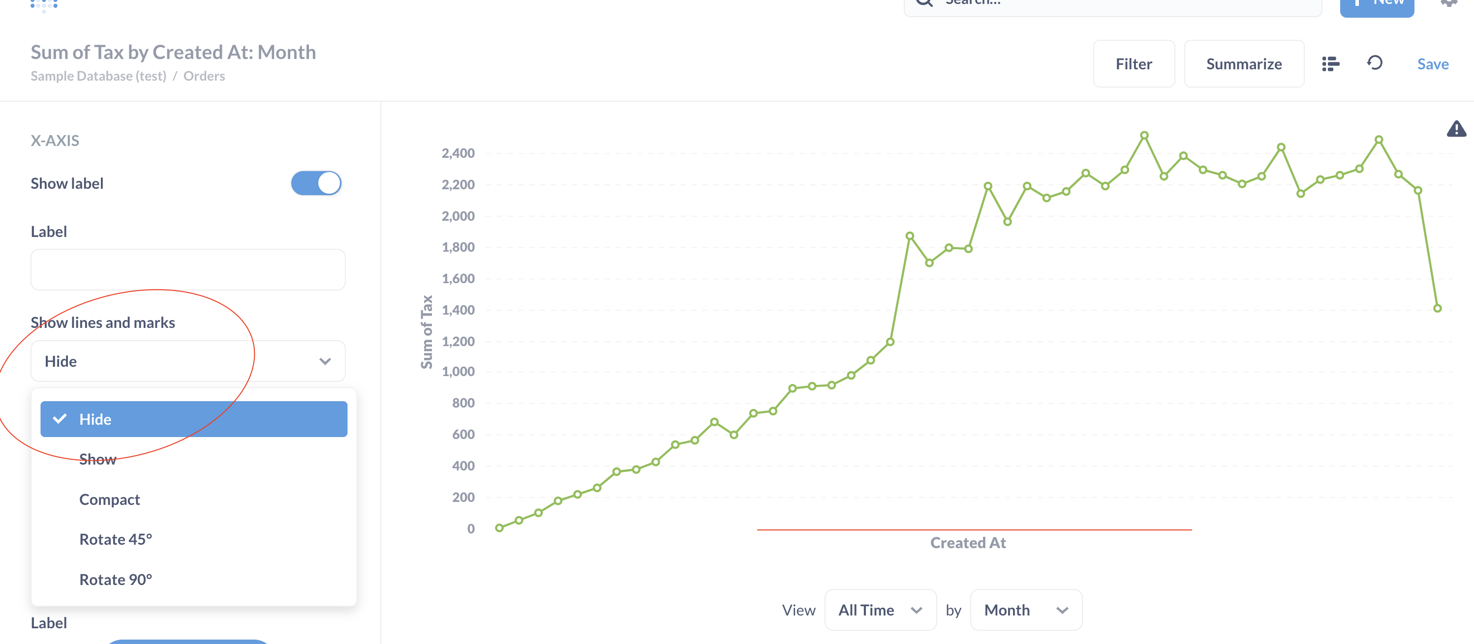
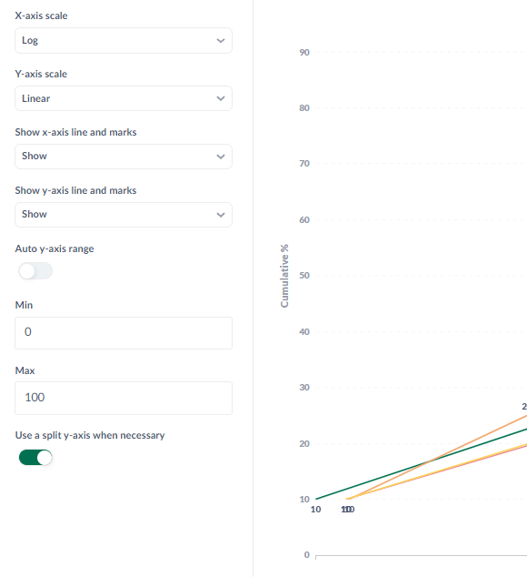
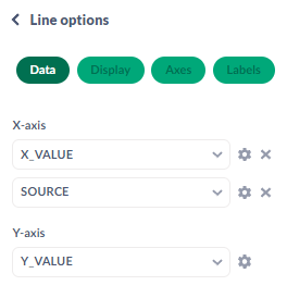
I'm trying to chart lines that have a regular interval of 0-100 for Y-Axis and then float values from around 0 to 250 in the X-axis. Y-axis has to be linear and X-Axis logarithmic so that the chart looks correct. However, for some reason X-axis is not showing the values even if I have the chart in full screen width on a 2K resolution computer screen.
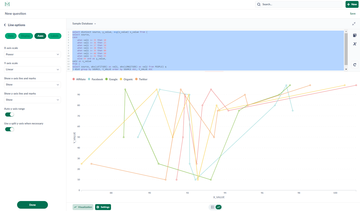
I don't know the version but the install is very recent, a couple months. The query is SQL based, and I can reproduce it with any data source.
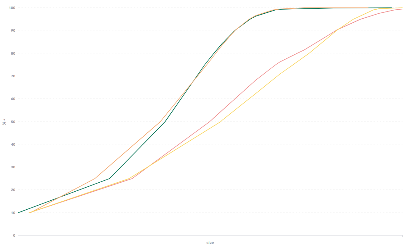
Here using the sample database:
select distinct source, y_value, avg(x_value) x_value from (
select source,
case
    when val1 <= 35 then 10
    when val1 <= 36 then 25
    when val1 <= 37 then 50
    when val1 <= 38 then 75
    when val1 <= 39 then 80
    when val1 <= 40 then 90
    when val1 <= 41 then 95
    else 99 end as y_value,
val2 as x_value
from (
select source, abs(LATITUDE) as val1, abs(LONGITUDE) as val2 from PEOPLE) q
) dist group by SOURCE, Y_VALUE order by SOURCE ASC, Y_VALUE ASC