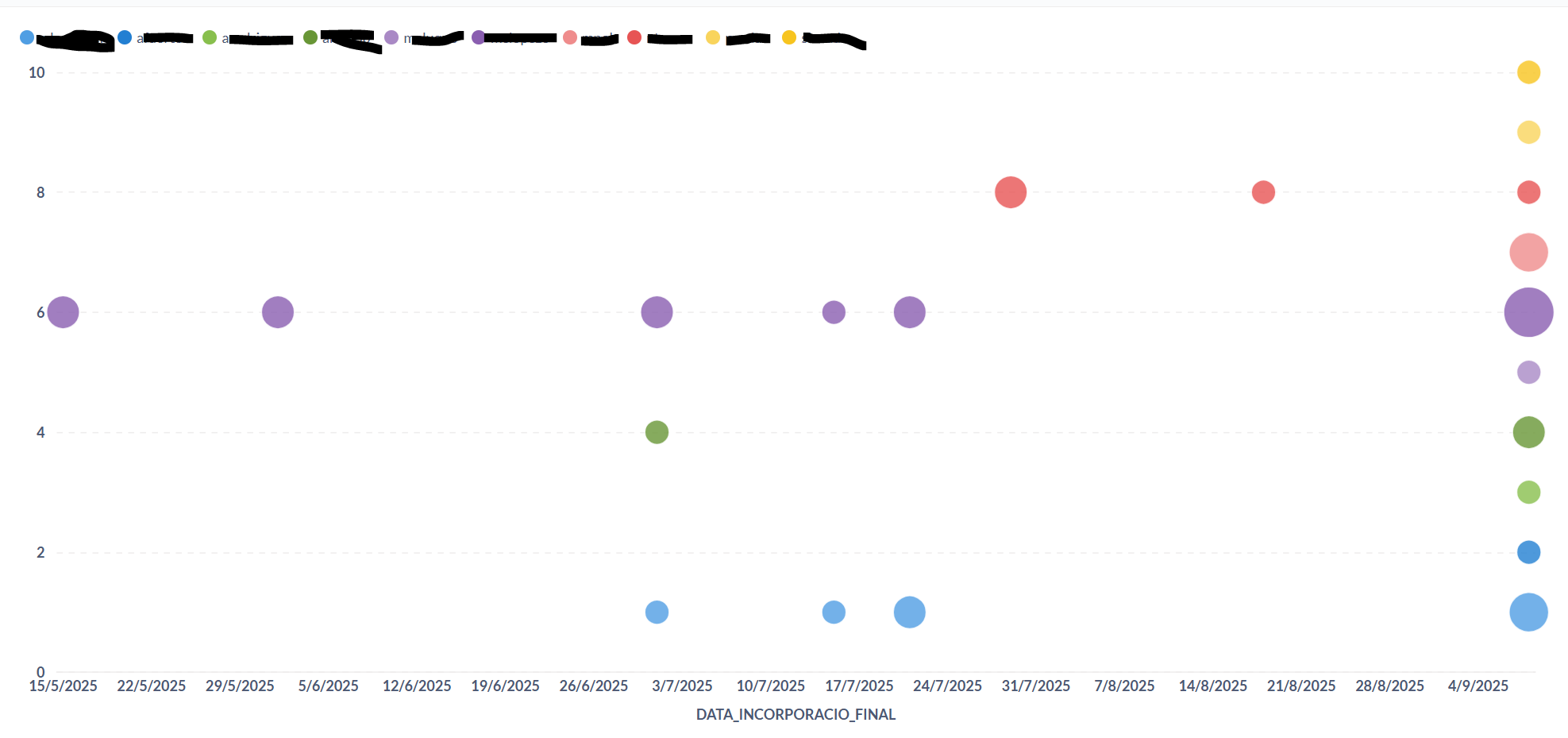
It would be great to be able to add a label to the y-axis in the bubble chart.
In my example, I'm visualizing each technician's workload (how many reports they have per deadline date), and each y-axis line represents a different technician.
I'm currently solving it by using colors and reading the names in the legend, but it would look much nicer if, instead of seeing something like 1---4 (which doesn't mean anything), I could see the person's name at each y-axis level.
Bubble charts or scatter plots require number values on every dimension, so I’d say this is unlikely to be implemented. The fact that you’re able to render this chart in the first place is only because you’ve represented one of your dimensions (technician) as a numerical ID.
One alternative could be to show this data in a table, and use conditional formatting to help quickly visualize technicians with the most workload. That way, you are showing the numbers explicitly, rather than having to guess based on the size of each bubble, while still providing a visual aid to help quickly compare between technicians.