Hi there
When two values are mentioned in view, y axis are combined, how can i show two y axis in the chart

Regards
Jayanthan
Hi there
When two values are mentioned in view, y axis are combined, how can i show two y axis in the chart
Regards
Jayanthan
Create one question for each rather than combining them in one.
Then, add one to the dashboard.
Once added, you'll see this at the top right of the question:

Click the line with Edit and you can add the other question.
Hi Andrew
It works. Amazing
Thank you
Regards
Jayanthan
hi all
when we add multiple questions, there are some issues,
E.g . one question is limited to top 10 Cash Sales, another question is limited top 10 credit sales, when these two charts are combined, it shows incorrect results, please advise
What results do you get?
it shows top 10 cash sales, where credit sales not shown for those customers
if the see below pic, there is no blue bars for middle chart lines(but there are values for that customers)
Red - Credit
Blue - Cash
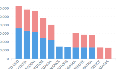
It looks like it’s showing what you asked for (rather than what you want) - the top 10 customers by credit sales and the top 10 customers by cash.
Only thing I can think of is to create a view that calculates the top 10 customers by total sales and use that to filter the customers for the credit and cash calculations.
You might be able to use the view to create a segment within customers (not tried much with that yet).
how to create segment for top 10 customers by total sales, please advise
I think you’ll need to do something on the database with a view or SP.