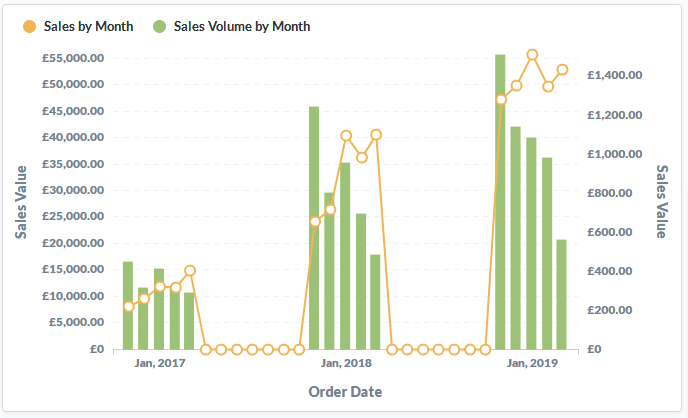
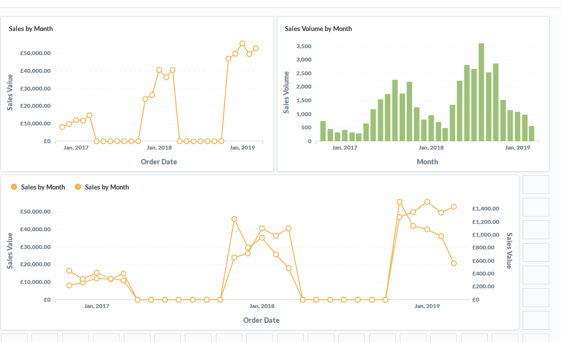
Dashboard below shows two charts, then both displayed as one.
Colours for both charts are the same and in settings, there's only one series to choose from.
Both series have the same name and can't be separated.
Was fine in 0.31.2
The issue tracker got a lot of activity the past couple of days, so you might have missed it
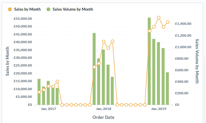
It's partially fixed in 0.32.2. The two y-axis labels are incorrect: