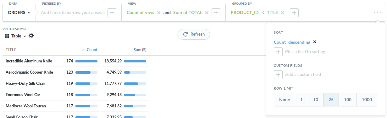
I’m not great with creating charts so was hoping someone could assist with the best way to see the data I am wanting, and how to put it together - I sell products, and want to see which products sell the best based on the amount of views that they have.
I have charts showing the sales - which in theory are your best products. Then I have charts that show the views - and some products with not as many views have fairly high sales - so I’m looking for a chart that merges this information and rates the products.
Can anyone help with what type of chart is best to visualize this with? (there are a LOT of products, so maybe doing it by brand is better) - and how to go about setting it up?