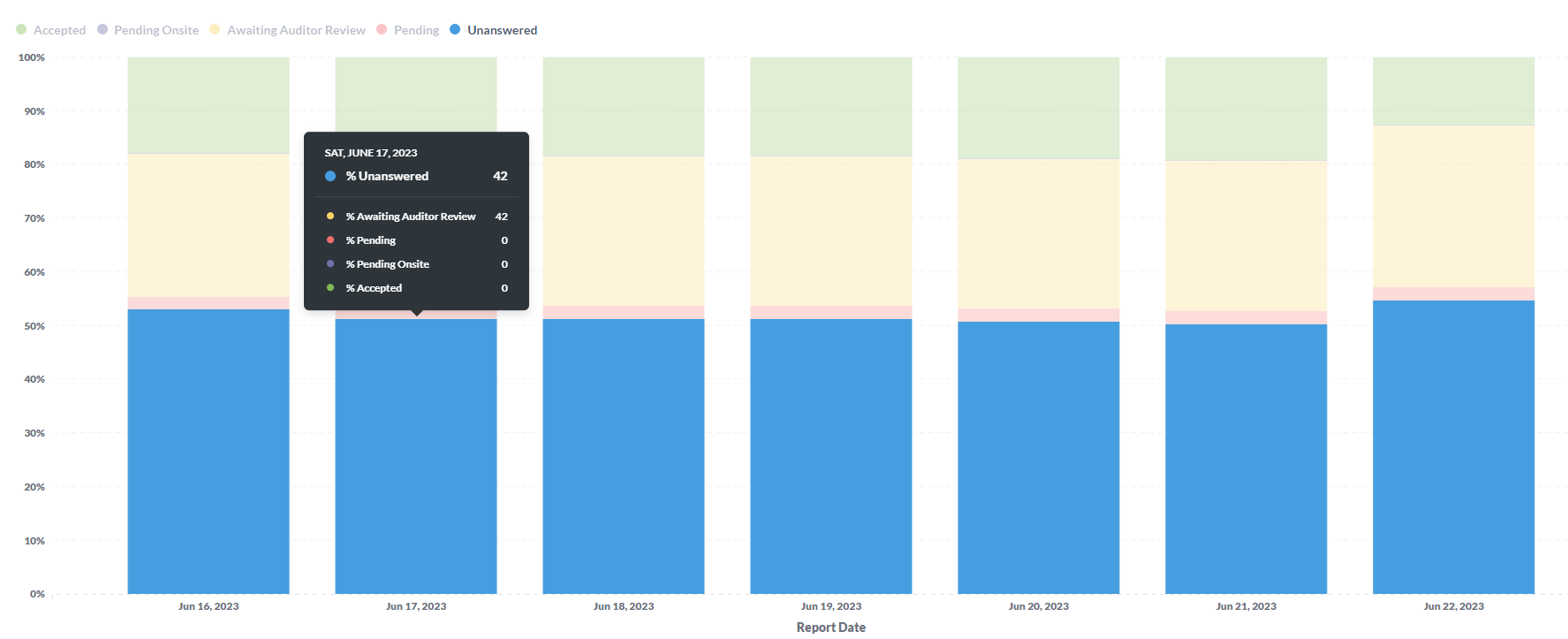
I have a report that was created before the recent upgrade. Overall, there are a lot of great things about the upgrade, but I noticed an existing report I have, which is a stacked 100% bar chart, now shows count of each category vs. percentage when hovering over each section. This report was built using SQL. Before the upgrade, it would show each section as a percentage, which is what I'd expect. Now the pop-up shows the count as a whole number, even though the tooltip designates it as a percentage:
@flamber , tagging for visibility. Thanks!
Hoping to get some help on this, as it's causing issues for the consumers of this report. To provide a bit more detail, when you hover your mouse over any of the days in the chart it's showing the actual numbers for the grouped field that happens to be at the top of the list in the raw data. So there are two issues: 1) It's not showing the cumulative over all grouped fields included within the filter, and 2) It's not showing it as a percentage of the total, even though it's a 100% stacked bar chart.
Is anyone else seeing this issue with the updated version of Metabase?
Tagging @dragonsahead to see if there are any updates on this.
Can you tell us which was the previous version and also the new version? Is this a sql or gui question?
Thank you, @dragonsahead, our current version is v0.46.6.1. I'm not sure what the previous version was. I believe this is a gui question. I have a report where my query gets a set of numbers, and I put those in a stacked bar chart (100%). When I hover my mouse over the chart, it shows the number for each section instead of the percentage, which is what I'd prefer and how it showed before the version update. Hope that helps, thanks!
@dragonsahead - any updates on this? Do you need any additional context to troubleshoot?
I face the same problem with then recent upgrade v0.47.2. There is a problem with tooltip for stacked charts.
After upgrade tooltip contains only data of this column (as in the first message in this chat). Before upgrade we could see all columns of the underline dataset. There were more useful information from the chart.
To sum up, after recent upgrade the tooltip for stacked charts became awkward, clumsy ![]()
1 Like
is it possible you're looking for Show other series values on the tooltip even when unstacked · Issue #29816 · metabase/metabase · GitHub
@Luiggi - It might be related to this update, but if so there seems to be a bug. It's not the visualization/aesthetic piece that's causing problems, it's the data piece. For example, if I have "Company", "Date", "Percentage Complete" in a data set, and I have a stacked bar chart that shows the daily progress of "Percentage Complete" over time, and includes multiple companies, so I'd want to see the cumulative percentage of all companies in the data set for a particular day, the existing tool tip is not doing that. It's only showing the numbers for one of the companies in the data set.
See here for more details.